WD Carriers
by ColinTierney • Uploaded: Sep. 29 '11
Description:
© 2011 Colin Tierney Design
As seen on:
Colin Tierney Design
Status:
Client work
Viewed:
3895
Share:
Lets Discuss
very nice monogram:)
Replylooks good
Replydeividas, edgar, thanks! and thanks to the swimmers.
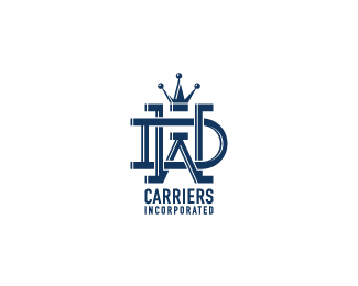
ReplyIcon looks nice, muscular and powerfull but it takes some time to read D and W letters. W is readable, but D is streched and goes below and around W so my eyes get little confused.*Othervise it's interesting, good looking and remarkable logo.**Good luck!**P.S. I'll appreciate if you could help me choose my logo.
ReplyNice monogram!
ReplyNice, Colin! Love the monogram, I really like how you chose to highlight the edges for a dimensional effect. The crown is a great touch too, works into the monogram nicely. The type below is the only thing I am wondering about. I think it is working ok but feels a little small and somewhat of an after thought. I would suggest trying a number of different possibilities, sizing, stacked, not stacked, maybe another typeface, explore it some - which you may have already done. You are seeking comments, there is my two cents. But again, really nicely done on the monogram!
Replybalic, nick, thanks for the comments. sean, i always value any criticism. your two cents are worth a c note to me buddy. i really have explored with various typefaces. DIN Schrift seemed the most appropriate with its elongated and narrow characteristics which i think compliments the monogram. i did however, chunk it up because it was lacking in appearance. let me know what you think.
Replythis is now client work. thanks for the comments and floats everyone!
Replysweet! best compliment a designer could get. CLIENT APPROVAL! :D
Replysure is, mike. always gratifying.
Replythanks david, yeah originally i was a bit concerned about that.
ReplyGood stuff, Colin, I liked how you worked it out.
Replyyou have great work, man. What i like about it is for the most part everything is done in the correct order. What I mean is that you don't try to wrap a logo around a style, instead you wrap a style around a logo. You have a wide range of styles in your portfolio (which is a great thing), but the common theme is that each piece is easy to read and recognizable for what it is. Don't ever forget that style is secondary and you will have a wonderfully prosperous career because i can tell that your eye for weight and balance is already top-notch. Thanks for sharing your work with us
Replyfar too kind, nate. i really appreciate your words and agree, style should always be secondary. thanks for the encouraging feedback.
ReplyLooks great monogram- strong intertwining!
Replythanks gennady.
ReplyPlease login/signup to make a comment, registration is easy