Luka Balic Design
by balic • Uploaded: Sep. 29 '11

Float
(Floaters:
29 )
Description:
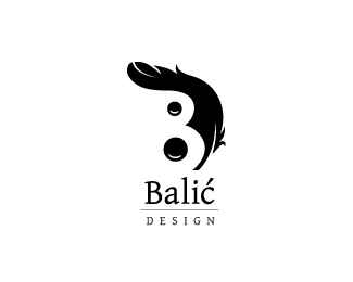
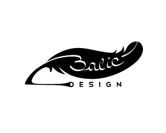
This is first of two versions for my personal logo.
Logo is made of initials of Luka Balic Design.
I wanted to incorporate feather in logo because feather was first design tool.
Second version here: http://logopond.com/gallery/detail/148262
Help me choose the right one.
Your comments are very wellcome,
thanks!
Status:
Work in progress
Viewed:
15857
Share:

Lets Discuss
Yep this is the better version of the 2 imo.**Should the tip of the feather be slightly more pointed?*
ReplyIf I made the tip thinner it wouldn't be visible when I scale down the logo, and I need it to be clearly visible because it forms the %22B%22 letter.**Thanks for comment!
ReplyI think you have an opportunity here to make something nice. I would forget the L, as 'Balic Design' sounds better anyway. I like the shape of the feather here, but don't know if it's enough to represent the B if you get rid of the L. I would play with maybe another two small parts of feathers or something to fill the space where the holes of the B would normally be.
ReplyI like the way you're thinking about the B letter.*I'll try that but I think D won't be visible if I put away L.*And I also like how this shape is closed with L, without it would look open. But I'll try what you suggest anyway.*Thanks!
ReplyI prefer this one mate.
ReplyI like the concept, but i think you need to work a little more on the fether part. For example the white line cutting in the tip of the feather is bearly visible, on smaller sizes it will desapier.
ReplyThanks on comments guys!*@dulesaga - I didn't want the line to be too visible (to distract).*But I guess I should make it little bit thicker.Thanks!
ReplyOut of the two posted I'd have to say this one hands down. Definitely the most original approach out of the two.
ReplyI don't see a 'D'?
ReplyHey, thanks for your comment. I think this is a better version of your logo. i think it's make better reading.**regards**Jorge Codina***PD: My english is not very advanced, sorry
Replythis looks pretty good :) What about of making an L a bit smoother ?
ReplyYeah this one is our favourite Balic. I agree with jands though, perhaps a more organic L would be more suitable? Nice work though.
ReplyThanks everyone for comments!**@nathantrafford : The %22D%22 letter is made of L and the feather.**@jands and @orca : Thanks for suggestion, I'm trying out some variations.
ReplyMy favorite %3B)
Replyagree ... my favorite too !
ReplyMy favorite toooooo! :) I think just simplify the 'Luka Balic Design' to just one font and you'll have a winner.
ReplySorry for the late reply here, Luka! I agree with the others here, I like this one best. I love the implied D shape, really nicely done in that hidden sort of way that you discover!
Replymy favourite
Replynice mark!:)
ReplyGreat design :)
ReplyPlease login/signup to make a comment, registration is easy