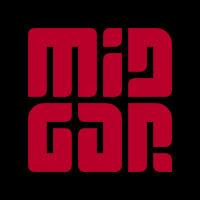
Dingole
by midgar • Uploaded: Sep. 28 '11 - Gallerized: Sep. '11

Float
(Floaters:
107 )
Description:
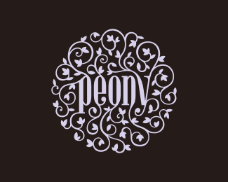
Dingole (meaning: to fling away; to dance with unusual abandon) is a group buying site that allows users to get huge discounts on lifestyle related
products and activities.
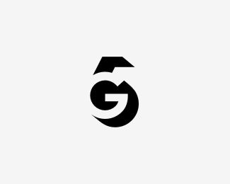
Standalone symbol that could replace the full logo in some applications:
http://logopond.com/gallery/detail/148121
keywords: elegance, high quality, laid-back, dynamic, active, spontaneous, friendly, positive, optimistic
As seen on:
Dingole
Status:
Unused proposal
Viewed:
30594
Share:
Lets Discuss
Swietne typo, Lukaszu.
Replyvery nice type treatment !!
Replysuper , gratuluje %3B)
Reply@ Milosz %26 Michal*Pieknie dziekuje :-)**@TaS*Thanks!
Replytasty type!
Replylovely :)
ReplyGreat type!
ReplyKeyword: Awesome!
ReplySuch a beauty!
ReplyVery lovely type!
Replywow, so lovely..!
ReplyGreat lettering work! Really wonderful flow.
Replyso nice!
Replythis is so beautiful. great type work. thumbs up.
Replyfeathering calligraphy!
ReplyBeautiful colors and type.
ReplyWhat a beautiful type! The colors are great too.
ReplyAn elegant solution!
ReplyC.U.D.O.
ReplyI like too much it!
ReplyBeautiful type, Midgar!
Reply%5E absolutely.
Reply@midgar: seriously, looking for critiques?*I think this typo looks flawless, the colors*the flow, the composition, imho this logo*is done already, congratulations!
ReplyVery nice type Lukasz!
Replythis is perfect!
Replyooops, I mean 5 STARS
ReplyDamn that's nice! Perfect mate :)
ReplyThanks all!**Unfortunately, right now I%60m about to change the status of this logo from %22WIP%22 to %22unused proposal%22, as my client decided, that it does not suit his needs best. Above all, that it does not match well with their pre-designed website:-/
ReplyNice curves Lukasz!
Reply@David**Yes, this is their website, and they do have a point with the logo not matching it. But my work has been based mainly on a neat briefing document, which, in my opinion, contains really clean and interesting ideas for the Dingole brand. Unfortunately, the website had been created before I started working on the logo, and I have to say, that I see next to none connection between the briefing and the website design.
Replythis is sweet, mate! :)
ReplyThe typography is beautiful.. Congratulations!!!
Replycongrats.**beautiful work.
ReplyBeautiful type! Well done.
Replyhis is so beautiful. great type work. thumbs up.
ReplyYes. Sweet
ReplySuper! piekne typo!
Replyso great! Floated & Faved!
ReplyVery smooth.
ReplyPlease login/signup to make a comment, registration is easy