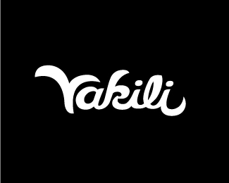
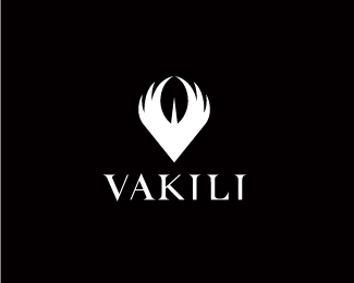
Vakili 2
by SeanHeisler • Uploaded: Sep. 22 '11

Float
(Floaters:
26 )
Description:
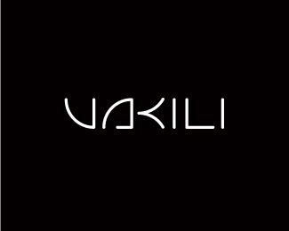
Proposal for an online store that will sell fashion products from jewelry to home decor featuring creative artists who design around the idea of reuse, renewal and recycling.
As seen on:
Sean Heisler
Status:
Work in progress
Viewed:
4748
Share:

Lets Discuss
from dusk till dawn ... Sean ... yeah man ... great type work as always ...
ReplyThanks, Bernd, really appreciate that! Sorry to post three versions like this, just trying to bolster the old showcase.
Replyniiice , gallery stuff !
ReplyThis one, for sure! Mate, any feedback from the client so far?
ReplyThanks, guys! Appreciate your comments, fellas. Nope, nothing yet Alen, she said she is really busy. I told her this one was getting the best reaction. Killing me she hasn't picked a direction yet!
ReplyHave to agree that his one hits the style for me better with the fashion side. Hope the client agrees soon. nice work all around on these though, Sean.
Replyagree with colegues this one is best from all gold pieces you have there:)
ReplyVery good font!
ReplyAwesome type! Definitely the best of the three.
Replyman , u got tallent for all the fonts ! :%5D
ReplyYeah, all of them are nice but I'm just not feeling the relationship between the %22L%22 and %22I%22 on this one. Feels a bit disconnected.
ReplyThanks everyone, I really appreciate it!*@Roko: I felt the same way when I first did this but somehow for me just works. If you think about any font really, that's pretty much the relationship you would have there in all caps. Maybe if the L were cheated some to close of the space. Appreciate the criticism.
ReplyLooking good Sean. IMO I think your terminals are a bit too big though.
ReplyIt is very good too.
ReplyNoted, Mike, thanks. Funny, I enlarged them right toward the end. I will look at those if we head this way, which I'm hoping. Thanks! Thanks, cleber!
ReplySean, I really really love what you've done with the type, but this doesn't really hit on the %22recycled%22 vibe. Yes, it's pretty and artsy, but it totally ignores the driving essence of this company.**If you were to somehow take what you have here, and render it to look a bit like the type is assembled from various %22parts,%22 I think you would come closer to nailing both the fashion and the recycled themes.*
ReplyThanks, jon, I appreciate it! I hear you about this concept and considering the type of products she will sell and the recycled vibe. The client is a bit torn on what kind of identity she wants to have and she wanted to see a concept that had a nod toward the environment/reuse aspect (concept 1) but then she very much wants to the identity to reflect her and her personality as well. Vakili is her last name. She is very much into modern style but loves to contrast that with traditional aspects and loves a blend of the two. Hence this concept. I tried to create type that was a blend of both modern and traditional, and yet tried to make it fashionable and unique. So these concepts, and another more script-like concept I did that is posted on Dribbble (which I felt needed more refinement), is a wide range of things for her to consider. Thanks!
ReplyGreat type Sean, I should agree with Mike on the terminals but even then the letters look sexy.
ReplyThanks for the clarity, Sean. It all makes sense to me, now :) In that case, I think this version is a fine translation of your client's additional request.
ReplyYou did great job here. Sexy terminals.
ReplyRudy, Jon and Jovan, really appreciate you commenting. Thanks. Cheers!
ReplySO COOL! Excellent work...
ReplyPlease login/signup to make a comment, registration is easy