Vakili 1
by SeanHeisler • Uploaded: Sep. 22 '11

Float
(Floaters:
7 )
Description:
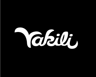
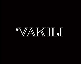
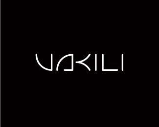
Proposal for an online store that will sell fashion products from jewelry to home decor featuring creative artists who design around the idea of reuse, renewal and recycling. Concept is an abstract Phoenix/V shape, leaf in negative shape.
As seen on:
Sean Heisler
Status:
Work in progress
Viewed:
5106
Tags:
jewelry
•
decor
•
fashion
•
logotype
Share:

Lets Discuss
i really hate to float all three, well not really because they all are really well done. really.
ReplyHey, thanks, Colin, I'm flattered you like all three. I appreciate it, man!
ReplyHey Sean, really nice job on all three concepts! While I do love the type in the other two, especially in your serifed concept, I think that this one absolutely nails the essence of the company. The Phoenix is a great symbol for communicating the %22recycled%22 vibe, and the stylish, modern way you've rendered it really addresses the fashionable aspect of the products.**What a cool project. You've done a great job, and your client should be pleased with your results.
ReplyThis is such a great concept, but the other ones feel more refined. Tough choice for the client.
ReplyLuma, thanks a ton, bud, good to hear from you and I'm glad you like it! Should hear from the client soon. If she does go this way, what areas of this do you feel is unresolved to you?*@Jon: Yep, I agree with you, this concept does hit many of the areas she wanted to explore kind of all wrapped up in one (see my comments in the other concept). I've been a little surprised that people have gravitated to concept 2 more than this, but I'm not complaining. Jon, I think I speak for many here at LP, your enthusiasm, helpful nature and ability to tell it like you see it yet friendly criticism is admirable and appreciated, it's good to see someone offering their time in the way you do. Thanks for your kind words and I appreciate your honest feedback!
ReplyHey, thanks for the kind words, Sean. I do what I can, because, while sites like LP primarily exist as sources of inspiration, I firmly believe that they should also be used as a platform for construcive criticism. An I give it like I would expect to get it: thoughtful, honest, and helpful. Comments like %22OOH PRETTY%22 are great for boosting one's ego - because, let's face it, we all love to think that we consistently %24%23!T out gold nuggets - but they don't encourage growth. And growth ensures excellence, and if we intend on changing the general public's perception of designers as flighty, dopey art-people, and of design as a simple matter of a few Photoshop %22design it now%22 button clicks, then we need to strive for excellence.**Like it says on an old Emigre mousepad I have from the late '90s: %22Design is a good idea.%22 I firmly believe this. **Anyway, back to your logo - I think the reason so many have gravitated towards %232 is based purely on aesthetics%3B it's very *pretty*. If it were for a strictly fashion brand, with no emphasis on the recycled thing, it would be perfect. But as I've stated, it seems to ignore a key aspect of the brief, and I think a lot of people favoring it aren't thinking about that aspect.
ReplyThis is definitly my favourite of theese 3.*Very nice phoenix icon in V shape - clever.*Also great font choice.*I also like the idea of leaf in negative space but I didn't see it. It looks more like coffe bean to me. Maybe try more leaf-like shape.**Good luck!**P.S. I'll appreciate if you could help me choose my logo.
ReplyPlease login/signup to make a comment, registration is easy