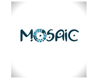
i love this concept. i think the only issue might be at a super small scale you lose the mark. especially on the inner ring. im also curious to see how the type would look without the dots, im getting a feeling they might be too distracting. regardless awesome design and love the colors.
Love this! I do agree with the others about that inner ring, though. It's too similar to the outer ring, at at that size, it really squishes all the individual shapes together.**And to be quite honest, I don't even think you need the inner ring. I think the way you have it in your other concept ( http://logopond.com/gallery/detail/146914 ) with the outer ring and the dot in the center would look great in this lockup - with the current multicolored shapes you have here, of course.
Great colors.*I agree with other commentary about the inner ring.*In type, perhaps , only with a dot at the%22O%22 it would be more clear and interesting.
I've provided a link back to this page, and I hope you'll be okay with me featuring your logo. I'd love it if you stopped by and let me know what you think about the article. Also, if you would like me to remove the logo, please let me know at ash @ ashmenon.com and I'll do so ASAP. Thanks!


Lets Discuss
Neat work! I think you could push this farther by making the center circle unique and not just a scaled version of the outer pattern. Nice text idea.
ReplyVery nice. I also totally agree with lumavine. Great point and would be even better if it were a simpler pattern as well because of the size.
ReplyLovely color utilization! Really nice result.
Replyawesome
Replyamazing :)
ReplyGreat thanks for Your comments!
Replygreat colors too.
Replygreat logo! :)
Replyi love this concept. i think the only issue might be at a super small scale you lose the mark. especially on the inner ring. im also curious to see how the type would look without the dots, im getting a feeling they might be too distracting. regardless awesome design and love the colors.
ReplyLove this! I do agree with the others about that inner ring, though. It's too similar to the outer ring, at at that size, it really squishes all the individual shapes together.**And to be quite honest, I don't even think you need the inner ring. I think the way you have it in your other concept ( http://logopond.com/gallery/detail/146914 ) with the outer ring and the dot in the center would look great in this lockup - with the current multicolored shapes you have here, of course.
ReplyGreat colors.*I agree with other commentary about the inner ring.*In type, perhaps , only with a dot at the%22O%22 it would be more clear and interesting.
ReplyHi there, I've featured your Mosaic logo in my Logos That Work blog post, which you can find here: http://www.ashmenon.com/logos-that-work-1/
ReplyI've provided a link back to this page, and I hope you'll be okay with me featuring your logo. I'd love it if you stopped by and let me know what you think about the article. Also, if you would like me to remove the logo, please let me know at ash @ ashmenon.com and I'll do so ASAP. Thanks!
Please login/signup to make a comment, registration is easy