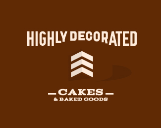
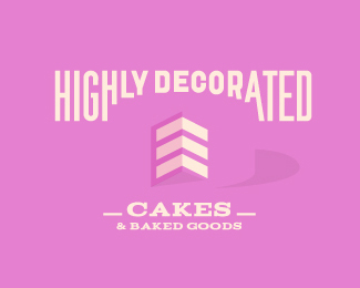
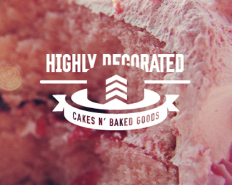
Highly Decorated fnl
by fools-e • Uploaded: Sep. 11 '11 - Gallerized: Sep. '11

Float
(Floaters:
73 )
Description:
Sans background as requested.
As seen on:
Fool's Errand
Status:
Nothing set
Viewed:
17801
Share:
Lets Discuss
Very nice. I probably would have raised %22highly decorated%22 up a bit so the cake is only barely cutting into it, but that's just me. Great work.
Replyyes ... that's great !
Replygreat piece!
ReplyReally clever - nicely executed too. I have to say that this one reads MUCH better as a cake versus your other submissions because of the plate.
ReplyReally cool idea!! I agree with designtofeel.
ReplyAwesome.
ReplyWonderfull!
ReplyThat is so great!
ReplyWow the integration of the arrows as the internal cake structure is very clever!
ReplyAmazing.. Great 3d effeckt :)
ReplyAs a former soldier, I say this is top notch. Love it.
ReplyThat is one tasty logo.
ReplySimple, but very clever logo design!
ReplyWay to go.
ReplyAHHHHHHHH...there we go. You were sooooooooo close with all your previous attempts, but this one seals the deal. What a way to work out an effective solution to this amazing concept. I'm so glad that your efforts paid off. Very nice to see this gracing the gallery. Love the pink 'n brown color scheme.**Regarding Sam's comment about moving the type up a little, sure, that probably wouldn't hurt, but I'm actually fine with it being where it is. YES, the cake does cut into the type a bit more than what some would feel comfortable with, but I really don't think it interferes with readability at all.
Replythe chevrons are so icing on the cake. awesome.
Replygenius. the wordplay, the sergeant chevrons, the use of negative space. outstanding work!
ReplyCakeeeeeeeeee :D
ReplyPlease login/signup to make a comment, registration is easy