Diesel (symbol for NAFTA one of 2012 Diesel collec
by CommunicationAgency • Uploaded: Sep. 09 '11 - Gallerized: Sep. '11
Description:
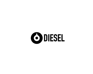
New symbol for Diesel 2012 one of collection. Collection will be called NAFTA. Symbol represent black oil (diesel nafta), with looking eyes in black circle. Symbol will be print from inside wears and on some t-shirts, pullovers and scarfs.
As seen on:
Communication Agency
Status:
Work in progress
Viewed:
14286
Share:



Lets Discuss
Prepare to buy new Diesel collections designers!
Replydaaaaaaaaaaaamn! So powerful, Agencija!
ReplyGracia deivi!
ReplyWhich Diesel? This one: http://www.diesel.com/ ?
ReplyYes Miloy that fashion brand Diesel.
ReplyIts only collection symbol they are using always diffrents symbols for fashion line.
ReplyThanks ivolve simplycity stay in head of custommers. When u look are famous brands are textual or very easy symbol. On logopond we are glamours and nice symbols.
ReplyYes that thrue. But question is what mass peoples can remember more?Fancy logo with nice illustration or ignore nice thing. Which symbol better communicate with people masses?
ReplyIt is much more efficient to wrap style around a logo than it is to wrap a logo around a style.**The beauty of simple, one color logo design is that it can have any number of different 'fancy' things wrapped around it at any time. Styles, like trends, change with the wind. That's what happens when a logo looks dated to us. It simply means that the logo was built around a style instead of the other way around.**Words to live by when concepting an idea.
Replygreat work, btw :)
ReplyThanks a nathan!
ReplyBold %26 simplistic. However, it's one of those marks that would popup in any of the Trademarks of the 20/30/40's publication. Nowadays, with the utmost simplicity there's a fair chance such a mark already exists or still is in use today.**Anyway, I like it's iconic presence.
ReplyIt imidiatly reminded to this one:*http://www.goodlogo.com/extended.info/2592*... and one of my own later designs (not for DIESEL of course).*However, I realise, that there are differences (also on concepts), but its close to each other anyway. But please do me a favour... close the huge gasp between the mark and the typo a bit!
ReplyThanks a Cresk!!
ReplyWatermark don't understood what to do? What is gasp? What need to close?
Replyhe meant 'gap'. The space between the icon and the word. I think the space is perfect as is, though. But I would make the entire logo smaller in this presentation just to give it some room to breath :)
ReplyHere is breath!
Replybella!
Replyahhh much better!
ReplyThanks ColinTierney1
Replysolid, memorable logo, Agencjia.
ReplyYes, sorry, I meant 'gap' (an ugly mistake of mine). I still think, the distance too large... but it just may be subjective feelings. %3B-)
ReplySo Watermarker gap-or-distance is now smaller. Feelings?
ReplyThanks a lot Mike Bruner! Cheers!
ReplySuperb work Agencija!
ReplyStrong and memorable design!
ReplyThanks a lot Vernics and PjMaster.
ReplySimple and Bold. Awesome work!
ReplyThanks a Justin Designs
ReplyIts better for me now... but what do YOU think?
ReplyBut is that for some kind of competition for Diesel? or for fun? Because somehow I don't believe that they would let you post it anywhere before the premiere of the collection, etc.
Reply%B4Milou do you like it? Make float and i will tell you %3B-)
ReplyCongrats on designing a symbol for such a MAJOR global brand%3B something that will be seen by millions. That's got to be a great feeling.
ReplyI am so happy cant wait. I buy all collection!
ReplyLove the design but it looks very much like that Statoil logotype. http://confbrussels.free.fr/21fev2006/images/Statoil_big.jpg
ReplyI saw another logo there, too --%3E http://goo.gl/g6cj7
Replythanks to inform me
ReplyPlease login/signup to make a comment, registration is easy