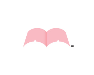
Royal Garden
by Pavel_Kulinsky • Uploaded: Sep. 05 '11

Float
(Floaters:
19 )
Description:
Updated version (smaller icon and more elegant lines)
Status:
Student work
Viewed:
7194
Share:


Lets Discuss
think it is still too big, but already great concept*:)
Reply:)Maybe maybe, but I think it's normal
Replyagree...this one is much better :) Love it.
ReplyHUGE improvement with just minor adjustments! Well done.
ReplyI do agree this is a great leap and it will receive a float, but something about the size still seems a bit 'cartooney' even though it's suppose to be conveying 'royal'. Hate to admit it, but it reminds me of Alice in Wonderland with the Queen's overly large crown. Just my two cents.
ReplyAnd please don't get me wrong, I love the direction and mark you've created. I think you're on a solid track here.
ReplyYes I agree with you appenion, It's a little bit cartooney.*But when i tried to make more serious it became noy so good. There was no graphic rhyme and metaphor.
Replygreat concept!
ReplyPlease login/signup to make a comment, registration is easy