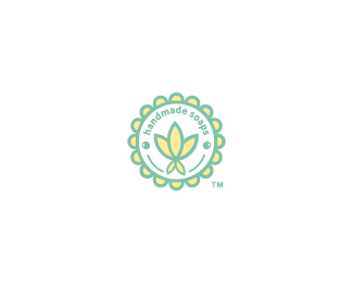
Kim-Brulee
by jennyb • Uploaded: Aug. 13 '11 - Gallerized: Aug. '11

Float
(Floaters:
53 )
Description:
Kim Brulee is a play on words to sound like "Creme Brulee". As the logo states, the product is handmade soaps. One of the main ingredients is aloe along with some other natural plants. The client wanted something that would appeal to the pampered female audience, something very feminine & dainty.
Status:
Client work
Viewed:
7535
Tags:
treat
•
high end
•
spoiled
•
toiletries
Share:


Lets Discuss
B E A U T Y !
ReplyThanks!%0D*
ReplyBul-bul! Classy
ReplyThis is really nice, Jenny.
ReplyWell, congratulations, Jenny. I'd say you met your objectives, and arrived at a very well-executed design. Feels very appropriate. Love the type. Is it custom?
ReplyNice Jenny. Been a while since I seen something from you posted.
ReplyThanks all! @ Atomicvibe - it's actually Oblique Serif Bold, I did modify it a bit :)%0D*%0D*%5E thanks Mikey, and yeah, I've been a bit of a hermit lately %3B)
ReplyLooks real delicate, done a real nice job on this one!
ReplyLovely, nice work!
Replynice color, so natural!
ReplyOh wow! Thanks for the nice comments all and, of course, for the gallery feature :)
ReplyAgree with the sentiments, nice one Jenny!
ReplyVery nice. I love the feel on this one. :)
ReplyCLEAN! I love it..
ReplyAll the nice comments are very much appreciated :)
ReplyPlease login/signup to make a comment, registration is easy