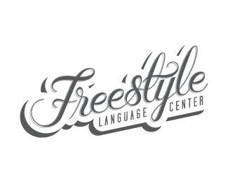
Freestyle Numero Dos
by VYshouldhavewon • Uploaded: Aug. 10 '11

Float
(Floaters:
12 )
Description:
Refined lettering / colors.
Status:
Unused proposal
Viewed:
1675
Share:


Lets Discuss
Thank you!
ReplyI like the general idea, but I have a question:**Is the type truly custom? I ask because the name of this center is %22Freestyle,%22 yet all your Es look the same. This makes the mark look like a stock typeface, thereby negating what would otherwise be a very keen relationship between name and visual.**If I were you, I'd at least try to find a way of personalizing each one of those Es, so that the type does truly look like it were created by hand.
Replyhmmmm, i have to agree with jon. also, i would let those Es breathe a little. they seem a little close.
ReplyHey y'all,*I appreciate the feedback. Yes, I drew the type, and thus it is truly custom, no it isn't a typeface, although the e's are all based on one original %22e%22 shape.**I think you're right, you've got some great input there. There might be a better connection between the name of the business and what you see if each character is unique. I'll work on that, see where it takes me.**Thanks again.
ReplyI%B4m loving the colors!
ReplyPlease login/signup to make a comment, registration is easy