Evoke
by SamDeMastrie • Uploaded: Aug. 02 '11 - Gallerized: Sep. '11
Description:
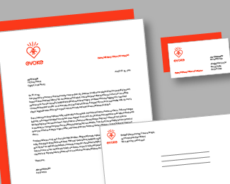
Born out of an idea in my sketchbook.
As seen on:
My Behance
Status:
Just for fun
Viewed:
11883
Share:
Lets Discuss
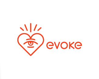
Like this arrangement better than the landscape version (horizontal one). The %22O%22 lines up perfectly with the center of the eye (two circular shapes aligned perfectly is very good). And, the bottom of the heart %22points%22 to the %22O%22 as well. Perfect choice for type as well -- looks custom, is it? Lovely work.
ReplyThanks, JF! Yes, it is custom type.
ReplyYESSSSS! That's so awesome you went with my name recommendation. I'm blushing. OK, that's probably just the alcohol flush, but whatever. I like how the icon and the type work together, and (not to pat myself on the back, or anything) I think the name hits a bit more on an emotional level. One thing, though, the V and K are looking like they're being a bit squished by those big 'ol circles. I would personally open them up just a tad. Oh, and I'm not crazy about the drooping bottom foot on that K. Perhaps if the top foot did the same thing, it wouldn't look so... uhhh... flaccid. I know this is %22just for fun,%22 but are you perhaps trying out a new studio moniker/brand identity?
ReplyUpdated. Slight tweaks on the V and K.
ReplyJon, right now this is purely for fun. I do like it a lot though, so I'm definitely going to keep it in mind for when I feel like I need to rebrand myself. Unfortunately (or not), I've got a few hundred expensive letterpressed business cards to get rid of before I go changing anything.
ReplyYou and me both, brother. Except, I have just under 1000 to go through :0*I had toiled endlessly over my current brand, and when I finally got to the point at which I was truly happy with it, I pulled the trigger on some turbo-custom, expensive biz cards. Then, about a month later, I was struck by a brilliant idea for a complete rebrand - name change, aesthetic change, everything. My fianc%E9e looked like she was gonna punch me when I told her my brilliant idea :B Anyway, I'll develop it atsome point%3B maybe use it for some type of ATOMICvibe sub-brand.
ReplyOh, the V and the A look MUCH better now. Nice one!
ReplyThanks, Jon. I appreciate your help and insight.
ReplySo clean and simple! I like it very much :)*By the way, you made really nice patterns from this mark! I saw them in behance :)
Replylovely line art:)
ReplyThanks dudes. I feel pretty good about it.
ReplyNice mark. Glad to see this in the gallery.
ReplyI Love it, memorable.
Replycongrats for being gallerized ... looks great
ReplyMuch better :)
ReplySharp and solid .
ReplyThanks everyone, I appreciate your comments (and floats).
Replyspecial one!*
ReplyThanks Gary.
ReplyEvokes masonry to me a bit, very nice.
Replyi dig this sam... well done!
ReplyAgree with Rudy, nice to see it featured, Sam.
ReplyRudy, Matt, and Sean: I appreciate it. Means a lot coming from you three.
ReplySo glad to see this one in the gallery. Congrats, Sam!
ReplyExcellent work, Sam!
ReplyThanks Gennady, I appreciate it.
Replycongrats sam :)*
ReplyReally good and I like your project, too :)
ReplyThanks Isaac, appreciate it.
ReplyThis project has been featured on Branding Served! Woo!
Replyhttp://www.brandingserved.com/gallery/Evoke/2024531
Thanks David, you got it.
ReplyI really like it, brow.
ReplyThanks, brow.
ReplyNice pattern.
ReplyPlease login/signup to make a comment, registration is easy