eggs
by watermarker • Uploaded: Jul. 29 '11

Description:
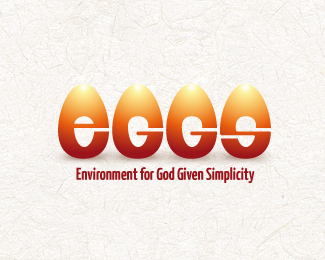
Well... a funny logo with a stupid slogan (just for the heck of it - would work even without). No connection to anything.
Note the egg-shaped negative space.
Maybe I'll add a number '5' in front of it, looking like a chopped egg, so its to read '5eggs'. Whatever...
Status:
Just for fun
Viewed:
3191
Share:


Lets Discuss
Reminded me of another design http://www.davidairey.com/logo-of-the-month-6/
Replyvery cool!
ReplyAh, luvamine, for real, I've never seen that before. its a bit different in concept and I must agree, that it has a better joke on it than mine.
ReplyAnd thank for the comments, both.
Replyerr...sorry... lumavine *blush*****
Replythe concept's already been used mainly for the %22e%22 which ive seen almost everywhere but implementing that concept to the G's and S is nice as well. uniformity there
ReplyThanks, kotan. Yes, its not hard to understan, why the concept is used alot already.
ReplyPlease login/signup to make a comment, registration is easy