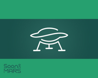
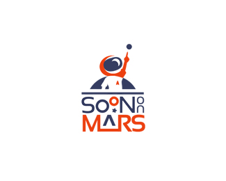
Soon To Mars
by oblak_ID • Uploaded: Jul. 24 '11 - Gallerized: Jul. '11

Float
(Floaters:
81 )
Description:
'Curiously Interesting Facts on Everything'
Innovation (a child's dream come true ). A rocket, the Moon and beyond.(changed from 'on' to 'to').
SOON TO MARS ALL RIGHTS RESERVED
Status:
Client work
Viewed:
15474
Tags:
astronaut
•
kid
•
goal
•
soon
Share:


Lets Discuss
I personally like this version better, i love the whimsical inocence of this mark
ReplyWhoa! I just noticed the rocket and the moon. Nice use of negative space! The colors are interesting, but I have to admit, I'm a bit confused about why you chose them. Naturally, one would associate a more orange-red, red, or rust color with Mars. On your other concept, others mentioned readability issues with having the word %22ON%22 stacked like that. Normally, I can't stand stacked type, probably because it was drilled into us in college that stacked type is a major graphic design faux pas. In addition to being visually unappealing most of the time, stacked type usually presents major readability issues. English-speaking people just aren't used to reading letterforms in that manner. If it were my logo, I would probably reverse the word %22ON%22 from a colored box, and run the word vertically downward, but that's just me. HOWEVER - in your lockups, I must admit, I really don't mind it being stacked. I read it instantly as %22Soon on Mars,%22 and I think most would also. Further, many of your design elements reach upward, conveying the idea of rocketry, propulsion, and upward lift, so to me, the stacked type seems to coincide thematically. Nice job, overall.
ReplyYes I love this. Very rich imagery and details.
ReplyThanks guys!**@Jon**These letters ( on ), among other things, remind me of the person ( 'distant' association ).
ReplyI read it fine and love the way it's stacked. The logo-mark is beautifully crafted with lots of hidden gems.
ReplyThis is a great logo! The longer you look at it the more details are getting clear. There are many small things to see like the moon, rocket, star, shuttle landing,... Great job!
ReplyThis is superb mark making, you can tell you have spent time figuring out the placement of the type. It got my vote and added to my favs :D
Replyb r i l l i a n t w o r k ! !
ReplyCongrats on the gallery spot, Igor!
ReplySuch a great job on so many levels, congrats!
ReplyRichard, Nicky, Ashley, Bernd, Jon and Alex, thanks, I really appreciate your comments!:)**@Jon **It's an interesting experience.%3B) Tnx
ReplyTnx, Freelance!:)
ReplyThank you, David !:)**Ben, tnx !)*
ReplyVery nice!
ReplyThanks, Matt!
ReplyYeah, when I saw the rocket I was like wow! Really neat.
ReplyAmazing job, really detailed, like mars near the moon in the nightsky. Even has the nasa type feel! Congrats %3B)
Replyi really like this great work
ReplyGreat position
ReplySean, Martin, Craig and Dipo - I'm glad you like it, Tnx!
ReplySo cool
Replycongrats on your gallerized, oblak :)*amazing work!
ReplyThanks, Jonny!)**Thank you, Athena. I appreciate your support %3B)
ReplyFor a moment I'm back baby, superlative work!
ReplyThanks Antonio!
ReplyInteresting. Cool colors.
ReplyThanks Julia and Jovan!
ReplyWow, this is truly amazing! Blew my mind when i noticed the rocket
Reply@cornflakez
ReplyAppreciate!
Please login/signup to make a comment, registration is easy