Brandsanity
by Brandsanity • Uploaded: Jul. 21 '11
Description:
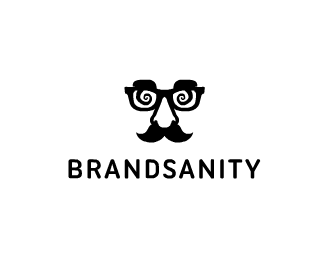
Really annoying myself on the personal logo front now - to the point where I don't even have one due to nothing being good enough. Pretty sure I'm going to run with this. Don't think i've seen it anywhere before but no doubt someone will correct me! I feel the word Brandsanity has quite a light hearted tone to it so felt the design should reflect that. I like to think of my logos as simple but quirky, and feel this novelty mask really represents that well. Also love the idea of how branding is like the costume of a business - and can make even the smallest of bedroom companies appear huge and trustworthy, almost disguised by the quality of design. I'm a Flash animator too so wanted something versatile that I could bring elements of animation into, and thought the face would be great for that with various expressions, movement etc.
As seen on:
Brandsanity
Status:
Client work
Viewed:
6494
Share:

Lets Discuss
Designing your own personal logo is a major, huge, enormous pain in the arse. It's the one area designers always have the most difficulty with, I believe. It's different designing for someone else%3B ironically, it's hard to get inside your own head, and to grab the info you need. Easier when it's someone else! Like this a lot. But, here's the 64 million dollar question: is it a style you can love? Loving it is essential. Otherwise, you'll wind up hating it later on.
ReplyThanks for the kind words man, really appreciated! Yeah that statement is too true, it's a real pain. I've been racking my brains for months now trying to come up with something and this is the first I'm actually (kinda) happy with and the first I've had good feedback on, so cheers! :)
ReplyI think it's great Daniel, I like it. There is a quirkiness to it but it seems to work well with the name. Love the spirals on the glasses!
ReplyCheers JF. Haha yeah, I'll just sit and think for hours trying to come up with something perfect, and unsurprisingly hit a brick wall every time. At one point I even considered hiring someone! Not to use the idea directly, but to get a few concepts from an outside view. Yeah I really am in love with the idea, both what it represents and what I could do with it - I'm just worried it may have been taken...**Would be awesome to hear peoples opinions on the eyes - with swirls or without? (See avatar)
ReplyThank you, Sean. Spirals it is then!**Cheers for the floats too everyone, feel so much better about this now.
ReplyThat, and it just looked a little cleaner without them! I think they do make it a little more interesting though and sit nicely with the word 'sanity'. Yeah it's rare it will be going any smaller than the size of the avatar. Working on a favicon now but will probably end up just using a segment of it! Maybe one of the spirals. Thanks for the feedback.
ReplyI like what you've created here, Daniel. The mark represents the name well.
ReplyThanks a lot, Nick. Really glad to hear you think so.**I'll have a play around, Ben :)
ReplyFirst of all, I love your showcase. You definitely have a characteristic style, and your logos are always so much fun and multidimensional. And they're always really GOOD. So from an outside perspective, what you've chosen as your brand identity definitely seems to align nicely with your aesthetic. It seems to be a faithful avatar for you as a designer, so, to that end, I'd say it's working. And I definitely concur with JF up there - designing for oneself is a tremendous headache. Congrats on arriving at a solution you're happy with. Re: your favicon, might I suggest just the mustache?
ReplyThe only logo that looks similar to this (that I've seen recently) is ilbeato, by andreiu. Other than that, I like the concept, and feel it reps your work very well.
ReplyThanks Atomicvibe, really appreciated. Definitely going to stick with this now (maybe with a few tweaks) and you've made the decision really easy for me, so cheers! You have a great showcase man. Them business cards are also damn good!**Thank you Chris, and cheers for pointing the other design out hadn't seen it before! I feel the concepts are different enough though, and also used in an entirely different context so there shouldn't be any issues :)
Reply@Daniel, ...and damn EXPENSIVE! But they're worth it, though. Thanks for the nice words :)
ReplyMade a small adjustment to the glasses - the spirals are now symmetrical and I feel it gives the design much nicer balance. They've also been rotated a little.
ReplyLooks good, but I seem to remember really liking the original spiral orientation.
Replyplease check Lytchee Design ... Logos .. side 2 ....
Replyhiho ... I've got this morning the sam email from this bastard ... he asks me to prove my ownership ...*I think we sould send him more mails ... I posted this case on facebook ... maybe we should think about other activities ... what do you think ?
ReplyDaniel, I LOVE the logo you made for me! Thank you again! /julia
ReplyPlease login/signup to make a comment, registration is easy