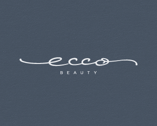
Ecco Beauty
by Lecart • Uploaded: Jul. 21 '11 - Gallerized: Jul. '11
Description:
A small natural/eco friendly cosmetics
company.
Status:
Work in progress
Viewed:
17756
Tags:
beauty
•
ecco
Share:

Lets Discuss
like the flow here, very good job
ReplyVery cool, Stel, nice flow, bro. Ironically I am working on a scripty-design right now that has tails like that too.
ReplyNice. So, curious: why is the line of the 'e' not connect to the first 'c'? There's a little space there, so it doesn't look like it's joined. Is that on purpose?
ReplyLine flow is nice:)**
ReplyGreat job. I like these long, elegant strokes.
ReplyBeautiful type.
ReplyWhat JF pointed out. That e needs to connect.
ReplyThe letters are really amazing, but name... not unique. Ecco is shoe's brand
ReplyI remember this client approached me several weeks ago. After receiving my quote I never heard back from her, lol. Now I wonder how many quotes she received :P
ReplyHey thanks everyone for the input. I appreciate that. I agree on the e-c connection, it was intended for the final logo. By the way, here's the original scan (for 2 proposals), drawn with a liner: http://cl.ly/8h1I and the current version of the selected logo: http://cl.ly/8hMh**@Gert, I don't know about quotes, I just hope that everyone involved in client projects gets the deserved funding.
ReplyOh, yeah that's Stelian!
ReplyCheers buddy, thanks!
ReplyI need to try this company I think)
ReplyLove it, bud!
ReplyThis one is really cool... Sorry I missed this one earlier :)
ReplyPlease login/signup to make a comment, registration is easy