Surf Company
by JF • Uploaded: Jul. 15 '11 - Gallerized: Oct. '11

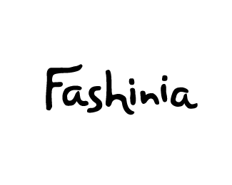
Float
(Floaters:
52 )
Description:
Envisioned to represent the motion of waves, flow, movement in surfing, etc. Notice the "h"; the negative space is designed to look like the beginning of a bigger wave. And, this was designed for a growing start-up. Unfortunately, the project is on-hold at the moment. Note: type is custom work, hand-made.
Status:
Nothing set
Viewed:
17847
Share:


Lets Discuss
beautiful lines.
ReplyGreat logotype, JF. You've represented the motion of waves very well.
ReplyJF i'm glad you let us see some more of your work, this calligraphy is definately flowy and very pleasing to the eye.
ReplyLovely flow!
ReplyI agree with the comments, nicely done.
ReplyThanks, everyone, for your kind words and floats. I'm really flattered. Glad you like it!
ReplyGlad to see this one back in your showcase...
Replynice :o)
ReplyYes this is lovely.*
Replynice typo
ReplyThanks for all the floats and comments, everyone! I really enjoyed this project. This type is a lovely thing to produce, if only just for the sake of producing it. Flattered by your admiration, everyone.
ReplyLove the colour love the shape, nice work!
ReplyThis is great, bud!
ReplyGood to see this finally made it to the gallery. Well deserved!
Replythis has such a great flow to it, fits the business very nice. solid design, JF
ReplyI grew a lot as a designer from this project. It truly helped me develop a keener eye for balance and flow. So to have it in the gallery today (along with another design of mine at the same time...wow!) is truly an honor. It may just be some of the best typework I've ever done. **Thanks, LP Gallery team, for choosing this design to be placed in the gallery. I am flattered you chose my work!
ReplyAnd, thanks for the nice comments and floats, everyone.
Replynice JF. glad to see this one made it.
ReplyVery nice typography!**I'm new here and would love you to see my profile.**Congrats.
ReplyThis has a really great flow and it keeps saying 'hi' to me :) Good work.
Replysweet work, love to see it in the gallery
Replybeautiful
ReplyAmazingly gorgeous!
ReplyWow, thanks rensdekker! That's appreciated.
ReplyAwesome typo, did you hand draw it first?
ReplyPlease login/signup to make a comment, registration is easy