Final Pet Groomerie
by jvogel • Uploaded: Jul. 12 '11

Float
(Floaters:
26 )
Description:
Labeling this final in the hopes that it will be just that... and that I will stop fiddling with it! :) Thank you for the looks, floats, and valuable feedback on this logo!
Status:
Client work
Viewed:
1990
Share:


Lets Discuss
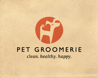
The dynamism of this type with the icon is FANTASTIC. Just as the negative space puppy goes beyond the border of the circle, so does the %22R%22 break the bottom horizontal plane of the type. **The type in this one has a quality the other versions don't have -- something in common with the mark it represents. This works, very well. Nice job!
ReplyThanks JF!!! Appreciate all your very thoughtful feedback. Glad you like this version!
ReplyCute. Great use of positive space within negative space. I saw the heart immediately. Nice one!
ReplyAnd FWIW, I think this execution is the most successful of all your Pet Groomerie attempts. To me, it feels the most balanced.
Reply%5EYep, spot on...
ReplyGreat to hear! Thanks Jon and Jordan... appreciate your comments!
ReplyLooks amazing! gallery material
ReplyThanks so much Daniel!! An earlier version of this actually made it into the gallery last month :)
ReplyI saw this on Dribbble and thought, yeah that's a nice illustration and left it that. Only now do I see the heart...beautiful and floated.
ReplyThanks Richard! I really appreciate the comment and float! (didn't post on Dribbble, but maybe Logo Lounge??)
Replyreally great one !
Replysuper !
ReplyI like this one the best with new type. Not sure about the "wag' though. I like the fact that it conveys movement but wonder if it's needed?
ReplyPlease login/signup to make a comment, registration is easy