CobraCube
by Raja • Uploaded: Jul. 19 '07 - Gallerized: Jul. '07
Description:
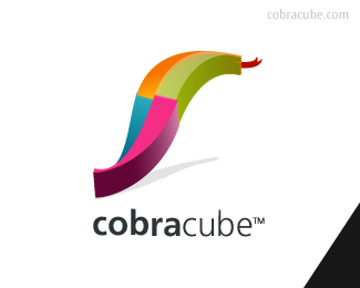
cobracube is a tech/design/idea lab project that I am working on
As seen on:
www.cobracube.com
Status:
Nothing set
Viewed:
22489
Share:



Lets Discuss
cool... hows about a cube kinda appearing from a woven basket?...
Replyi like it, but i see a leaf more..? Or is it just me?**Perhaps more flared head like they have? or the tongue more forked?**Cool though _b
Replyvery nice Mr Raja
ReplyI like it, very nice coulour scheme. Could you please explain why the cobra is back turned? Is there some reasons about that? Excellent tough.
Replylike the colours, would prefer it coming at you rather then away from you.
ReplyThomas, I'm glad you brought that up. I was thinking the same thing, but then thought to myself, %22Wait, it looks like the snake is protecting the wordmark/brand. Which, in turn, I kind of like. Nice job, Raja. I don't think it's quite there yet, but it's coming along. I really like Nido's idea of incorporating a weave basket of some sort. That would really convey the technology aspect of things. Even so...you've done well.
ReplyAny of you noticed the black triangle in the corner. Does that play any role in the identity?**I like the idea, but I do agree it needs more work. To me, the head of the snake seems a bit larger in proportion to the type. **I would like to see the final as well.
ReplyRaja, you need to work more on the shadow, doesnt go well with the shape of the snake.. ,cant wait to see the final version.
ReplyGood idea, but needs a little more to be perfect. I do like the way you have the cube cobra, but why in that way? Most be something behind the whole idea.
ReplyI'm curious how this will translate to a one-color or reversed logo.
Replytoo strange and distorted. Shadow makes it seem like it's falling on it's side. good idea but needs a bit more work.
ReplyGood job, dude!
ReplySo Amazing!
Replyahh - not that great at...but thanks all for looking**I just saw it here in this article - by chance - they don't credit the designers**10 trends that will define logo design in 2008*http://www.logoorange.com/logo-design-08.php**
ReplyPlease login/signup to make a comment, registration is easy