Delfex
by janzabransky • Uploaded: Jun. 28 '11 - Gallerized: Jun. '11
Description:
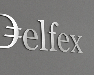
Logo and corporate identity for company trading with foreign currency. I was working on this project last two month. I made for client whole identity set from logo design, stationery design, web design with programming part, copy-writing including slogan and finally design manual.
Logo on this photo is mounted in headquarters office on a wall. It was carved out of brushed aluminum plate to gain metallic look which is symbolic interpretation of currency, money and prosperity. Metallic effect literally connects whole identity. All stationery is printed by PANTONE 811 C metallic silver color. For selected materials such as business cards, compliment cards, envelopes and documents folder was used special silver metallic paper.
As seen on:
Delfex website
Status:
Client work
Viewed:
7928
Share:
Lets Discuss
I like the way metallic look strengthens impression of finance/wealth.%0D*%0D*BtW Company website link needs to be fixed.
ReplySolid corporate logo work.
Reply@Rosta thanks for broken link warning *@Richard thanks
Replylove this, as i said before on dribbble:) lovely logo, very corporate:)
Reply@Deividas appreciate your notion.
Replydisturbing, IMO
Reply@Jurcek Could you please explain?
Reply...Yeah, I'm interested to...
ReplyErm, what...?
ReplyIn my opinion, that image is not well appreciated the composition of the logo.
Replyha i think there is just a translation problem. I think what he's getting at is that he just wants to see the logo on its own, in it's purest form (none of these crazy photo shenanigans, crazy kids!), and i'd have to agree. Love seeing this version, just want to see a nice, boring version too of it just sitting centered
ReplyI not so understand that it, for what an angle of slope and unnecessary effects.
ReplyI'm not sure if people are seeing this right and that is causing the stir. The image here is of cut metal letters up on a wall - and it looks great.
Replyyou can always click on the website link to see the flat version. I enjoy seeing the work come alive in real applications.
Reply%5E Yeh, me too - it's good to see some real deal sometimes.
Replythere we go! the link wasn't working the other day when i tried it. I have nothing against seeing photography of work in action! I enjoy it actually! just as long as we can see the flat version somewhere too!**beautiful mark, btw :)
ReplyPlease login/signup to make a comment, registration is easy