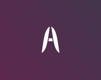
Aventure Host
by HelveticBrands • Uploaded: Jul. 18 '07 - Gallerized: Jul. '07

Float
(Floaters:
10 )
Description:
This was created for a network solutions company. The mark changes in color for each branch of the company ( mail, media, host ). Since I have created this design it has been modified by another designer for their websites.
As seen on:
Aventure Host
Status:
Nothing set
Viewed:
7850
Share:


Lets Discuss
I agree climax, maybe if they would have at least used the same typeface!
Replylooks like lips.
Replythe logo on the website has an extra %22pair of lips%22! having your logo changed sucks!
ReplyI love it!
ReplyWow they butchered it... Looks like they're using Verdana (?!?!?!?!) or something in the new %22updated%22 logo present on the site. I'm not really surprised judging by the rest of the website...just looks like another generic corporate hosting company providing %22solutions%22. Ugh.**By the way, your logo is quite nice :). Too bad they had to alter it to blend it in with the rest of their %22identity%22.
ReplyVery striking Dache. All too familiar story %3B)
ReplyThanks for the positive feedback guys
ReplyYour version looks great, your colour choices made it strong. Too bad they changed it. So many people just go with what they %22like%22, instead of what's good for their company (and what most other people will actually like, and positively respond to).
Replyhmmm ... nice logo the extra pair of lips dont neccessarily suck as much as i thought but definetly one that hits the spot .... and one you have to come back to time and time again ... good job
ReplyLOL!
Replyi see a red flag
ReplyThanks for the positive feedback everyone
ReplyPlease login/signup to make a comment, registration is easy