Pet Groomerie U
by jvogel • Uploaded: Jun. 01 '11 - Gallerized: Jun. '11

Float
(Floaters:
57 )
Description:
WIP. Would love feedback!
Status:
Work in progress
Viewed:
7106
Share:


Lets Discuss
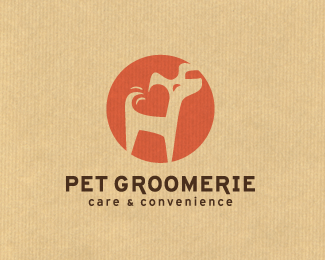
Imho this is the best in terms of simplicity, colours and just about everything : )
Replythis is the one
ReplyInstead of black type, I think it would look better dark brown.
Replymy vote too
Replyme too
ReplyWinner!
ReplyI agree with everyone
Replycool sign, pleasure composition
ReplyThanks so much for all the comments! Looks like I'm maybe at least getting close to the right solution for this :) @designtofeel I think the brown type might work better as well.
ReplyYep, what they all said.
ReplyCongrats! Nice to see the process of this one. You really took it to a whole new level!
ReplyGreat stuff!
ReplyHey... thanks so much for the gallery entry!!! And for the comments! Really appreciate the feedback.
ReplyYou deserve it. This is wonderful.
ReplyCongratulations, Jessica! Well done!
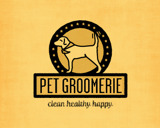
ReplyThanks Trish and Stefan!! I've made some adjustments since this upload. http://logopond.com/gallery/detail/139537 Getting close to being final... I think :)
Replynice sObak:)))
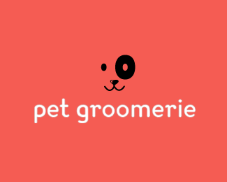
ReplyI would add a small line to the dogs face to make it look like its smiling because the dog looks a bit like it doesnt have a face... other than that, SUPER CUTE!
ReplyThanks Sergey! And thanks Lily... I will definitely take a look at that!
ReplyVery nice! And LOVE the colors!
ReplySolid!
ReplyWould like to see a more geometrical font, heavier weight, not so drawn out in kerning (spacing).
ReplyPlease login/signup to make a comment, registration is easy