Description:
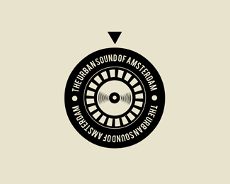
Logo design for The Urban Sound of Amsterdam, a record label.
As seen on: Status:
Client work Viewed:
15255
Tags:
label
•
record
•
music
•
urban Share:
Thank you all very much! Really appreciated :)*@ Moisespb: It won't be used on very small applications :)*@ Lumavine: I did try, but client liked this better (I think I did as well)*This design was chosen out of 2%3B the other one: http://logopond.com/gallery/detail/137795*
It's funny how you are the first to notice! But yes it's true (unless you've got a double one). Well aware of that, client is a dj himself. It was a deliberate choice of the client. The intention was not to create a real turntable. Just to 'play' with it. As you might know, a turntable doesn't look like a stamp as well... But because of these little details the design is very recognizable. It also stands for an outstanding company, not the 'regular thing'. But very clever of you guys and good to mention! Appreciated :-)
Adapter are disposed on the left and you do not argued, because it is far too conventional and not proportional to the disk.
And the more there is no argument the client's opinion, since he even professsionaL, but the DJ and not a designer.
Vladimir


Lets Discuss
Very good, taste very of this type of mark. The small name can cause some problem, but this depends on the application. Very nice, good work.
ReplyGoood!
ReplyCool concept
ReplyI wonder what it would be like if %22the urban sound%22 was on the top half of the circle, and %22of amsterdam%22 was on the bottom. Good work!
ReplyVery cool mate!
Replywow... great concept mate..
ReplyThank you all very much! Really appreciated :)*@ Moisespb: It won't be used on very small applications :)*@ Lumavine: I did try, but client liked this better (I think I did as well)*This design was chosen out of 2%3B the other one: http://logopond.com/gallery/detail/137795*
ReplyWell deserved, congrats Jos%E9!
ReplyThank you Milosz :)
ReplyNice. Is it just my young man memories gone bad or didn't all record players have the arm on the right side?
ReplyI second Glen, it's always on the upper right corner (I had my short DJ carrier so I know a thing or two).
ReplyIt's funny how you are the first to notice! But yes it's true (unless you've got a double one). Well aware of that, client is a dj himself. It was a deliberate choice of the client. The intention was not to create a real turntable. Just to 'play' with it. As you might know, a turntable doesn't look like a stamp as well... But because of these little details the design is very recognizable. It also stands for an outstanding company, not the 'regular thing'. But very clever of you guys and good to mention! Appreciated :-)
ReplyYea I noticed that too. The cool thing is that it will play backwards the way you have it!
ReplyWell here we go... in the gallery!*Nice one Jos%E9!
Reply@ jose...I'm sold.
Replymuch better
ReplyThank you!
ReplyAdapter are disposed on the left and you do not argued, because it is far too conventional and not proportional to the disk.
ReplyAnd the more there is no argument the client's opinion, since he even professsionaL, but the DJ and not a designer.
Vladimir
Please login/signup to make a comment, registration is easy