Beach Crew
by JustinBakerDesigns • Uploaded: May. 16 '11
Description:
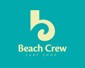
*UPDATED* Revisited - Looking for some feedback. Lower case b with a wave/letter c in the negative space.
Status:
Work in progress
Viewed:
8439
Share:

Lets Discuss
Love the idea, but not the light green colour. Perhaps try the 'b' in either black or white rather? I like the aqua colour as it forms the wave. I think that the inside curve of your wave could be rounder. Maybe even ending in a perfect circle? I also think that the name you chose, 'B-Wave' is a bit obvious. Unless this is for a client, I would suggest a name that's less predictable. This could be a real winner! You've got some strong pieces in your portfolio. Hope my comments help. :-)
Reply...I hope that the second word of the brand name starts with C... %3B)
ReplyThanks Simon! Your kind words mean a lot to me. I'm still new to this industry so all the help is greatly appreciated! I completely agree with working on the roundness of the wave so I will try to upload a more rounded wave soon. I also will test the b in a white and see how it looks. As far as the name it was just something I threw up there because I hadn't thought of one yet...Thanks again!
ReplyHey Alen, it can...Any thoughts for a name? This is just portfolio work for now (trying to build a stronger portfolio so I can hopefully soon attain a design job) so it can go in any direction.
ReplyWell, something in the line of %22Beach Crew%22 label for surfers maybe? %3B)
ReplyIt's obvious to me: a perfect fit for your portfolio ste and business name would be....Justin Baker Creative.
ReplyBeach Crew definitely works. Thank you%0D*JF definitely could be a possibility one day...Thanks!
ReplyJustin,**Nice mark. I agree with Simon about how the inside curve could be rounded out a bit more. The green color is okay, but would explore different options. Maybe even a nice cream color instead of white? Can't wait to see more from you. :)
ReplyThanks Kyle! Now I am anxious to find some free time to get in there and make some changes to this one. Glad you liked it.
ReplyThanks for the floats guys
ReplyAlen's a genius. I love 'Beach Crew'!
ReplyI Second That
ReplyLOL Glad yah like it chaps!
ReplyCurves could use some work but I like it :)
ReplyThanks Gareth working on uploading the updated version now...
ReplyUpdated my curves and colors...Let me know how you feel about the updates! Thanks Everyone!
Replyseems kinda forced, right now. something needs to go more subtle, in my opinion, though i'm not sure what yet. the wave/c needs love. the top of it could go thinner, while the bottom goes thicker.
Reply... Such rough discussion and only 6 voices.... It isn't good... :))
Reply%5E we're designers, we're SUPPOSED to be critical! it's all out of love
ReplyThanks for the input Nathan. I do appreciate all the comments and critics they are only going to make me a better designer which is my goal at the end of the day.%0D*%0D*And Sergey Thanks for looking out for me bud
ReplyGetting better! What if the lower part of the b was the same as the negative space wave? kind of like a ying-yang feel? Like the new cream color!
ReplyThanks Kyle...Hmm I will have to explore that option. I just dont want to lose the wave effect. Ill see how it works...
ReplyYes, Justin, probably you even itself hasn't understood that has made. But you have made - a magnificent sign!
ReplyThank you Sergey means a lot!
ReplyI think it is time to start hunting for a font for this guy!!! :)
Reply*Updated*
Replyfont - gavno, but sign.....nice!
Replygavno%3Dcrap right haha...I'll keep playing with the font
Reply:)*
Replyreally nice Justin**ck this out http://youtu.be/kkGeOWYOFoA
ReplyThanks Raja!
ReplyWent back and did some updating to this logo. Hopefully you all like the changes!
Replyvery nice, give it a little breathing room and scale it down 30%25.
ReplyThanks Colin. I appreciate the feedback!
Replysign..... very nice. I like it.
ReplyThis logo will be in iheartlogos season 2 book!
ReplyPlease login/signup to make a comment, registration is easy