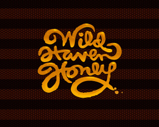
Wild Haven Honey
by Mikeymike • Uploaded: May. 10 '11 - Gallerized: May. '11

Float
(Floaters:
71 )
Description:
WIP_1: logo for a honey label.
Status:
Work in progress
Viewed:
11116
Share:
Lets Discuss
playing around for a label for my wife's new venture...honey bee's.*she wants to sell the honey at farmer's markets. Just toying around at this point. Thoughts?
Replythis is sexy. The dot on the 'i' has too much detail, and i think that is just the tiny little dot it creates in the middle of it. It's definitely well on its way. I think there is an inconsistency in line weight right now, as in some letters have wonderful thick and thin weights, while some are fat and blobby. i would work on (in order): W - middle and intro ear are too fat. l - fat. d - fat. H - love this letter except the far left part has a weird little fat nub. e - bottom of it is fat. y - something about that bottom loop is a little off. needs some weight variation. *Overall love where this is going! That second H is gorgeous! Seriously can't wait to see this completed!
Replyfinely origin style of letter's lines, Mike*I like it)))
ReplyFine style I meaning*
Replyvery nice Mike!
ReplyLOL, Alen! Sorry to hijak, Mike, just having some fun, buddy.
ReplyThanks everyone for the nice comments. still some kinks to work out, but it felt like it was heading in the right direction.*Sean, Alen, not sure how you found out this info from my wife... curious! LOL good stuff guys, my wife (Janea) will have a chuckle over the comments. (she has a different name for that, but can't tell ya!) (:
ReplyLovin it Mikey!
Replythanks, roko, means a lot.
ReplyLove this loopy casual lettering. So charming. Your wife's gonna sell bucket-loads of honey with this sweet image. Come on Sean %26 Alen, please beehive yourself! %3B-)
Replythanks Simon. i sort of like the looser ink brush type myself.*UPDATED: did some minor tweaking on the thicker lines and changed out the dot on the %22i%22. nothing major for now. still like the real loose look and feel. (and NO Alen and Sean I'm not talking about my wife,) (:
Replyi think 'Honey' is perfect. 'Haven' is aaalmost there with the exception of the 'e' and maybe a touch of love to the tail on the 'n'. in 'Wild', the W still feels heavy. Maybe try a completely different approach with it where the outside parts of the W curve outward instead of inwards so that it matches the feel of the two 'H's below? The right side of that 'l' needs some love, too. Hope this helps! Lookin great!
ReplyNiiiiice!! :)
ReplyNice one Mike!
Replygreat type mike :D
ReplyGreat job, Mikey. Love it.
ReplySweet type. Love!
ReplyGreat work mike! Sweet!
Replythanks for the gallery spot and all the nice comments. really appreciate it. Still going to tweak this baby, I'll post when I get there. Thanks for the suggestions, Nathan. *cheers all.
Reply%5ELooking good Mikey.
ReplyLove this one Mikey :)
ReplyMike and Muhammad so good to hear from ya. thanks for the comments, really appreciate it.
Replynice concept mikey..
Replythank you, hamidos. glad you like the direction, sir.
ReplyUPDATED: took the %22WILD%22 form my second concept and placed it on this version. I think it has better balance. Thanks for the comments on both concepts, everyone.
Replywoohoo! I miss the smoothness, though. almost there! is your wife happy?
ReplyShe's always happy, I'm lucky. (:
Replywhen the wife is happy, all is right in the world
Replyvery nice lettering
Replynathan, you got that right. (:*bernd, thanks for the comment. still cleaning this up.
ReplyWhen are you going to be featured here?*My wife wants to keep bees as well, so you will probably see a honey label uploaded from me in the future.:)
Replyi also don't understand why Mike not featured yet, can anybody tell? Btw, sweet letters:)
ReplyGood luck with the bee's when you get them. they are actually pretty cool to watch work. Its fun, but don't mention it to my wife, I pretend I only want the honey.*And thanks Jerron and Deividas, for your feature support, but there is a lot of talent here so I can see why I'm not in there. no worries. *Cheers and have a great weekend.*Oh and Jerron can't wait to see your honey label design, probably blow mine off the shelves. (:
ReplyUPDATED: I have started to really smooth out the type more, still working on it though. But thought I would show the progress. thanks, hope you like the improvement. (You can see how rough to first type was on my V-2.)
ReplyThis logo appears very cute and compact to me - I think that it would make a great honey label logo! As a newbie, I am inspired by the mixture of fun and professionalism in this logo... beautiful work! Cannot WAIT to see it complete, although if you declared it %22finished%22 now, I would be just as impressed! :)
ReplyPlease login/signup to make a comment, registration is easy