Screen & Digital Print Awards - 2011
by VERG • Uploaded: May. 03 '11 - Gallerized: Jan. '12
Description:
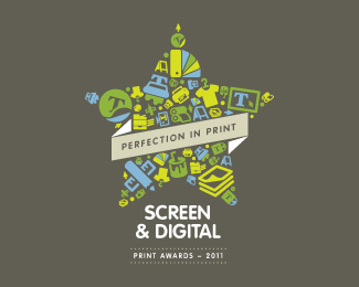
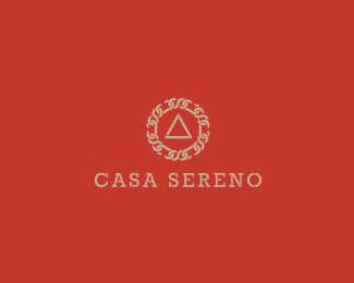
Since my Therian logo wasn't used, I saw an opportunity to further explore the icon pattern style for another client.
As seen on:
BEHANCE
Status:
Client work
Viewed:
14900
Share:
Lets Discuss
Not a huge fan of that typeface, but I really love everything else. Full project looks great on Behance, too.
ReplyWhoa, dude! This is amazing. Love it. Agree on designtofeel's comment regarding the font. Colour palette is typically Matt - unusual but way cool.
Replythanks guys and really appreciate the feedback. will definitely revisit the font over the coming days and update the design.
Reply*UPDATED. I'm more happy with this simple version of the typeface and i've also incorporated the by-line into the mark. thanks again for the feedback simon %26 sam.
ReplyPerfection. New font looks great! Loving the banner too. Good on you mate. Fair dinkum. Shrimp on the barbie. And all that. %3B-)
ReplySweet.
Replythanks my friends.
Reply@ simon - I prefer a potjie on the braii
ReplyGood work fellow!
Replycheers champ!
ReplyGood work, Vergad!! Regards! :)
ReplyCheers Lorena!
Replyamazing :o)
ReplyThanks Ita!!
Replyvery nice
Replycheers orca
ReplyFresh! Love it.
Replywow, i missed this. excellent, matt.
Replythanks pauly and colin, and big thanks to the LPG pickers. it's always a nice surprise to see your work on the home page. champions!
Replysuper brand
ReplyGood work. Like it.))
ReplyThanks guys and appreciate all the floats from my fellow ponders
ReplyVery nice :-)
ReplyFeatured Here:
ReplyA Fascinating Collection of Star Logo Design
And again, thank you for the feature Manuel. A nice selection of star themed logos you pulled together.
ReplyPlease login/signup to make a comment, registration is easy