Create and Sew
by Brandsanity • Uploaded: Apr. 26 '11
Description:
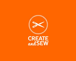
Logo for a new crafts/sewing website. Here, two sewing needles have been crossed to create a pair of scissors. Unsure whether to have the dot/screw in the middle or not (are the scissors obvious enough without it?) Any feedback appreciated :)
Status:
Client work
Viewed:
10898
Share:



Lets Discuss
I saw scissors and also a clock face in addition to the needles. great concept!
ReplyThanks man! Ha, the clock face never even crossed my mind but that's cool :)**Also i've flicked through a few of these so not entirely sure which version you're referring to, ended up just going back to the original though for now!
ReplyScissors are pretty obvious I would say no need for the dot. Nice work!
ReplyI dig it! Should the type scale down to be same width as mark? You probably already tried that.
ReplyPlease login/signup to make a comment, registration is easy