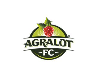
Agralot FC
by Oronoz® • Uploaded: Apr. 21 '11 - Gallerized: May. '11
Description:
For a Berries production company
Status:
Client work
Viewed:
24456
Share:

Lets Discuss
So realistic Alan :-)
ReplyOu! Kalinka-Malinka!
ReplyThnks Milou!! was a bit challenging achieve the effect of illumination without a picture reference!! :)
ReplyKalinka-Malinka?? :)
ReplyYes! The russian song - http://www.youtube.com/watch?v%3DBUQ1PQMM7vA%26feature%3Drelated
ReplyBrilliant!
ReplyThis is stunning Alan. You're the master!
ReplyGood stuff, love the rendering of the fruit.
ReplyThnxs lot guys, I really apreciate it!! :)*@LadyGrey - Love the song!! :)
ReplyLove it buddy! the lighting is sick!!
Replyclass!
Replyphenom...
Replythanks for the compliments amigos!!
ReplyNice to see ya posting again. Looks Berry nice.
Replyhahaha Thnks a lot Master!! Nice comment!! :)
ReplyGreat berry man :)
Replyalways a pleasure viewing your stuff mate...
ReplyThis is one sharp logo. So refreshing!
ReplyVery plesant logo :)
ReplyThanks for your comments guys!! I really appreciate it!! :)
Replythis is sooo sharp, colorful and SWEET. Alan you da berryman.
Replyhahaha Thank you Master!! :D
ReplyIt really is awesome.
ReplyGreat job yet again Alan. Love how realistic the berry looks :)
Replyberrylicious!
Replythis is amazing! berry is fantastic!
ReplyTasty!
ReplyVery realistic work!
ReplyVery like it! Perfect brand logo Alan!
Replygreat work.. nice concept.. i like the illustration..
ReplyThanks a lot gents!! :)
ReplyI keep coming back to this one. Very tight. Raspberry: top shelf. Strength is fantastic.**One liiiiittle tiny thing: Maybe reduce %22FC%22 about 5-7%25? We don't want the piece to be out of balance (obviously), but it feels like it's crowding its space just a little.
ReplyThis is just as solid as they come.
ReplyWith a logo like this on a package, I don't even mind what's in there:)
ReplyPlease login/signup to make a comment, registration is easy