Art Eagle
by alexmark • Uploaded: Apr. 16 '11 - Gallerized: Apr. '11
Description:
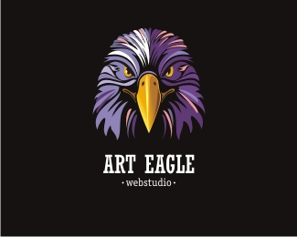
Logo for webstudio design.
As seen on:
none
Status:
Unused proposal
Viewed:
19635
Share:

Lets Discuss
Wow, fabulous.
ReplyRealy nice bird :)
ReplyAmazing illustration!
ReplyThanks!
Replyvery nice... great showcase too!!
ReplyGood work
ReplyGreat illustration. But I agree%5E the mark is overpowering the text.
ReplyStella font choice and personally%5E I think the balance of mark to text is near perfect with the beak as a break in colour and line of force. Great work!!
Replypowerful!
Reply**** yeah! you made imposible...
ReplyMark execution is brilliant, as usual, but the overall lockup is not there yet (I agree with guys that mentioned it). Sizes, positioning and even the style of both text lines need more attention for better complete balance.
ReplyEagles forever, Alexey!
Replyso nice
Replyawesome!
ReplyGreat eagle mark.
ReplySharp Design %26 Great Colors !
ReplyBrilliant work..loved it.
Replythat bird look awesome!
ReplyThis is gorgeous. Really fantastic work.
ReplyPlease login/signup to make a comment, registration is easy