Elevator Company
by guezworks • Uploaded: Jul. 09 '07
Description:
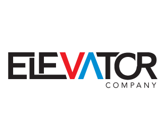
Here is a concept logo I am working on. The "V" and "A" symbolize the up and down arrows.
Any Ideas on what to do with the "T"? It is killing me right now.
Status:
Nothing set
Viewed:
5374
Share:

Lets Discuss
You don't need to do anything with the 'T'.. cos you don't want to over crowd it mate... i see two things going on in there. I think you should have one or the other. **
ReplyWell the thing is that I feel the points on top are to sharp. I guess i might be to picky.
Replypoints are fine mate.. looks good!**Is this logo a personal project or is it for a client?.. you could curve the right hand bar of the 'T' around the 'C'.. possibly?
ReplySimple and to the point - love that. Not thrilled about red and blue, but overall great logo.
ReplyThanks CACPRO, the colors are still not set in stone. I am looking at other options right now.
ReplyYou've got a great concept here! However, I feel the busy play on the type is distracting from it. What if you really simplify the type and let the arrows work for themselves. Something like what Nido did with his Talkmore logo. Because his type is so simple, it allows for the clever play on the 'a' and 'e' to stand out more. http://logopond.com/gallery/detail/8150 Just some thoughts.
ReplySpot on Ocular, let the the arrows do the talking.
ReplyGood idea ocularink, thats prob where i need to go. i may be thinking to hard
ReplyPlease login/signup to make a comment, registration is easy