Bjork Dental
by Mikeymike • Uploaded: Apr. 07 '11 - Gallerized: Apr. '11
Description:
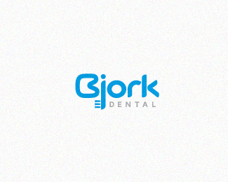
Final Client approved concept.
Status:
Client work
Viewed:
12633
Share:
Lets Discuss
what ya think? overkill?
Replyit looks realy interesting..different:) but rk it should be like this?I mean kerning. Or didn't notycing something?:)
ReplyNO FANTASTIC!!!!!!!!!!!! It KILLSSSSSS! it can be one of best logo for 2011 in the world! I like it much!!
ReplyBj -face?
ReplyVery nice work Mikey :)
ReplyI see tooth and brush.
ReplyThanks for the feed back. I was mainly going for the tooth and the tooth brush. There is a face, but it distorted and I really don't want to try too much for the face because I lose the %22B%22 tooth effect. IMO. I guess I was wondering if the tooth brush was not needed? The %22B%22 as the tooth, I thought might be enough, but I did like the brush, so I was just curious.*thanks for the feed back. gets me thinking, and that's always a good thing. cheers.
ReplyI see B as tooth. Brush is very stylish dont change! Brush is giving feel of dentist. B can in second plan what is very clever!
ReplyThanks for the comment, Agencija. I was hoping everyone saw the tooth and brush.*As far as your first comment %22best logo of 2011%22....well little over the top, but very nice to hear. I see so many fantastic logos on here and other sites, and I just love the feed back. thanks.
ReplyThats communicate verywell with people mass.**Best logo is not when u make for you, or for other designers, but for normal people which can comunicate to their head! *I see strong mark.
ReplyThanks again for the comment.*And I agree, my end goal is always to make the right connection with the customer, or end user. Point taken. cheers.
ReplyLovely concept Mikey. I would go only with the tooth:) Also, maybe you could soften a bit more the rest of the characters? (%22j%22r%22k%22 seems a bit too sharp for the rounded %22B%22)
ReplyI was wondering if anyone was going to bring that up. I was actually trying to hit towards the look of tooth paste as you place it on the brush. round smooth shape but that final little pointy tip as you finish placing. very subtle attempt, but maybe your right on rounding them off a bit. the name is so short, I thought I could play a little. (:
ReplySmooth like toothpaste!
ReplyAgencija (:
Reply%22I was actually trying to hit towards the look of tooth paste as you place it on the brush. round smooth shape but that final little pointy tip as you finish placing.%22**Yeah, good thinking Mikey, I like the idea:)
ReplyUPDATED: I did round the sharp corner on the letters a tad, while taking the legs of the %22k' out just a bit. I believe there is a better balance now.*And thanks Rokac for getting me to look again. I think I still have my tooth paste feel, but the corners were just too sharp.*thanks for the feed back. the client is leaning this route, so that' good.
ReplySUBTLE UPDATED: rounded the %22b%22 a little to show more like a tooth and shorted the %22j-brush%22
ReplyReally cool one Mikey!
ReplyWondering if the dot on the 'j' is even necessary...maybe it's just me MB :)
ReplyGreat stuff buddy! One small thing though, I'd put the 'dental' in the lighter shade of blue, it kind of drags my eyes to it too much.
Replytwo good points to take a look at. Client is going this direction, so I am waiting on his feed back (if any) and then I will explore this further my friends. thanx.
ReplyI like it. But I think that word %22dental%22 you need stretch (proportionally) to the end of a letter %22k%22 and vertically align to center of brush fibers.
Replythanks for the comment, Stalex. Still working on some fine details.
ReplyUPDATED: worked on the %22B%22 tooth and the DENTAL kerning.
Replysoo fresh.
ReplyThanx, Colin.
ReplyFINAL Client approval. Feels good when you get the final thumbs up.*Now stationary package.
Replyvzhikalka) good lettering, Mike!
Replythanx, Alena. much appreciated. cheers.
Replyfresh concept!
Replyhaha, great find man, realy nice :)
ReplyVery clean and friendly, Mike. I like how you cleverly avoided the usual 'tooth with roots' routine.
ReplyDeiv, Ivan and Roy thanks gents. Always a pleasure to get the feed back. And thanks so much for the gallery spot, always a treat to get showcased along side so much other talent.*cheers.
ReplyCongrats on the gallery! Well deserved...
ReplyThis one is fantastic!!
ReplyThanks, Jordan.*Oronoz, and big thanks out to you as well. Appreciate the comments gentleman.
ReplyClever
ReplyWell done..deserved gallery spot
ReplyPeter, Craig, thanks a ton gents. What nice things to say. cheers.
ReplyWorks great Mike!
Replythanks, josh.
ReplyThis is a very good example of what I class as a great 'Logotype'. Sometimes I see pieces of bastardised text creep in the gallery through the back door and get shot on the spot for asking why. Every logo should have substance not just style and this has loads of both. Worthy contender for 2011 IMO.
Replycool work mike
Replyjonnyd, thanks man those were some kind words. appreciate it.*sj, thank goes out to you also , man. cheers.
Replyjonnyd, thanks man those were some kind words. appreciate it.*sbj, thank goes out to you also , man. cheers.
ReplyPlease login/signup to make a comment, registration is easy