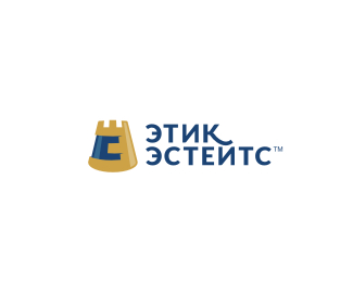
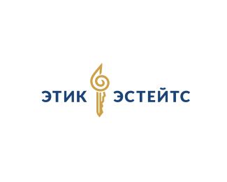
Etik Estates
by Type08 • Uploaded: Apr. 05 '11

Float
(Floaters:
9 )
Description:
Logo for the real estate agency from Bulgaria. The core of their services is selling coastline estates and this time it was inspired by the sand castle form (base for showing the 'oborotnoje E' letter).
Status:
Client work
Viewed:
3058
Share:


Lets Discuss
really great shapes. but mark reminds me chocolate candy a bit, maybe it is brown color. hmmm.. idea with sand castle is very good, maybe try to improve it more..? what do you think? :) it is just my opinion..
ReplyThanks a lot D! I returned it to the initial combo of blue and gold. What do you think about it now?
ReplyLookin great man!
ReplyThanks Stelian!
ReplyCool one.
ReplyThanks Simon! Of the 5 concepts I sent their way I think that this is my favorite (including the reversed one, also posted here).
ReplyCool*Bulgarian BD like as Russian BD
ReplyYup, the same. Actually, their target clients are Russian customers that would like to move to the coastline (living or vacating).
ReplyI'm meaning first the letter of the words
ReplyYeah, I know what you meant :)
ReplyPlease login/signup to make a comment, registration is easy