Victoria
by DesignerAG • Uploaded: Mar. 31 '11 - Gallerized: Apr. '11
Description:
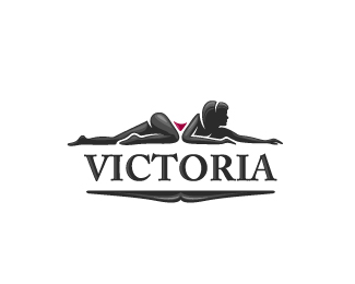
Unused unfortunately.. Cocktail glass in the center of woman.
Status:
Unused proposal
Viewed:
22026
Share:




Lets Discuss
interesting Matto, why they didnt choose it?
ReplyThanks Deividas. They didn't like how she looks. Something like a cheap slut as they said. Anyway, it could be a good logo for a striptease club then :)
ReplyI think she looks a bit naughty, indeed. :D
ReplyRrr
ReplyGuys... Maybe she lost her earing...
ReplyI quite like this greatly.
ReplyJust add a tiara. Nice work.
ReplyWhat was this for? I like it--very classy, I think.
ReplyGuys, maybe she's drunk?:)*@Alen*Lol*Kiddin Matto, clever concept I must admit:)
ReplyStellar stuff Arnas! Hey victoria would you like to spend some time ? :D
ReplyThanks to everyone for the comments! You guys are always kind :D%0D*%0D*@EBrown, nice hint, thanks!%0D*%0D*@khughesdesign, it was for the hotel for mans mostly, so client asked me to do something with a girl :)%0D*%0D*@Rokac, there could be many versions why is she lying with a cocktail glass :D Thanks!%0D*%0D*@vernics, meet Victoria. Victoria, this is vernics :D Thanks Ali :)
ReplyHave just updated it. Think it looks more lively and finished now :)
Replythis is very cool, but reminded me of Prince of Persia cut in half%0D*http://www.ljplus.ru/img4/1/3/13mu/prince.jpg :)))
ReplyHa ha! Won't argue with you :D Thanks!
Reply@13mu*Lol! This brings memories, I love that game!
Replyawesome game%0D*60 min to save a girlfriend :)
ReplyActually she reminds me of Srdjan's new hot younger female designer. You guys remember??
Reply%5E Yeah!
ReplyGreat graphic concept
Reply:( but people love cheap sluts.. I think this mark is beautiful.. it's a shame they didn't go with it.. awesome illustration too
Replyand top-less..
ReplyThanks to everyone for the comments :)%0D*%0D*@ClimaxDesigns, you're right, it looks better, so I've just updated it. Thank you!%0D*%0D*@dannygdammit, I guess they were an exception :) Thank you for the support!
Replyhot pussycat :%3E Matto, can i ask...? Your girlfriend posed? :))))
Replylol Deiv! :D Unfortunately no.. There was some offers, but I denied that and now you can see my imagination only :D
ReplyThank you btw!
Replyshe looks yummy!
ReplyShe looks very yummy - It is to be drunk and licked
ReplyThats super sexy... and very well illustrated...*Unfortunate that it isnt used...
ReplyOmg imagination :))
ReplyImagine the casting call on this...honey...arch your back do slightly...Oh, I broke my pencil:)
Reply%5EHaha Fabian.
Replythis looks very nice!
ReplyBrilliant! %3Bo)
ReplyAbsolutely love this.
Reply@Fabian %22priceless%22:)*@matto Sexy Logo.
ReplyVery good. Cocktail glass isn't quite obvious, but is great as well.
ReplyGreat looking logo. Yeah agreed, cocktail glass is not easy to see.
ReplyI just loved the symmetry of the graphic! Never would have seen the cocktail glass if not brought to my attention.*What about the typography? spacing between the letters seems off... VI CT O RIA
Replymake her a mermaid and then you got a logo for a seefood resturant :) good one this!
Replylike it!*
ReplyNice one...I like how the bottom piece seems to relate well to the woman figure.
ReplyHey, this girl has a mustache!
ReplyLooks great!
ReplyTo make it work for high class bar maybe giving her a red jessica rabbit like gown would make it more premium look....just a thought....anyways amazing inspiration....
ReplyPlease login/signup to make a comment, registration is easy