by contrast8 • Uploaded: Mar. 18 '11 - Gallerized: Mar. '11
Add to Pad (In 53 Pad s )
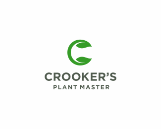
Description: wip. logo for foliage company. Status: Work in progress Viewed: 14908 Tags: green • c • leaf • foliage Share:
Lovely mark buddy! Although I see some slab serif with it for the brand name part. Thoughts?
thanks Alen. yeah still working with it soon will update:)
Simple and strong.
thank you Pierro :)
Great mark Deividas!
updated. thank you Alen for sugestion. Thanks Ali:)
Like the new font, nice one!
This is sweeeeeeeeta!
thanks Harris, Sean, Mike apriciated:)
Beauty Deividas. Great type choice also.
Great logo :)
sweet work, dude.
thanks, hope client will like it also:)
gratz'!
aciu%3B)
Top notch, buddy.
thanks Milou:)
LIKE!T
This is beautiful my friend :)
i wish i could vote for this 5 more times
thanks guys:) realy apriciated:)
Simple and Clean
I agree, I think it works really fine with this font.
thank you, i wanted, that client choose this one. :)
Crisp, clean, and elegant. I can totally picture that mark being blind embossed onto some beautiful, recycled paper (with all the flecks and specks in it) as part of a stationary package.
lovely! those swirls reinforce the organic aspect.
Please login/signup to make a comment, registration is easy
Follow


Lets Discuss
Lovely mark buddy! Although I see some slab serif with it for the brand name part. Thoughts?
Replythanks Alen. yeah still working with it soon will update:)
ReplySimple and strong.
Replythank you Pierro :)
ReplyGreat mark Deividas!
Replyupdated. thank you Alen for sugestion. Thanks Ali:)
ReplyLike the new font, nice one!
ReplyThis is sweeeeeeeeta!
Replythanks Harris, Sean, Mike apriciated:)
ReplyBeauty Deividas. Great type choice also.
ReplyGreat logo :)
Replysweet work, dude.
Replythanks, hope client will like it also:)
Replygratz'!
Replyaciu%3B)
ReplyTop notch, buddy.
Replythanks Milou:)
ReplyLIKE!T
ReplyThis is beautiful my friend :)
Replyi wish i could vote for this 5 more times
Replythanks guys:) realy apriciated:)
ReplySimple and Clean
ReplyI agree, I think it works really fine with this font.
Replythank you, i wanted, that client choose this one. :)
ReplyCrisp, clean, and elegant. I can totally picture that mark being blind embossed onto some beautiful, recycled paper (with all the flecks and specks in it) as part of a stationary package.
Replylovely! those swirls reinforce the organic aspect.
ReplyPlease login/signup to make a comment, registration is easy