ibragger
by lumo • Uploaded: Mar. 14 '11
Description:
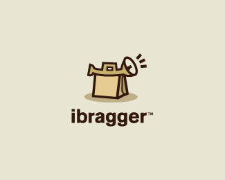
Another concept for ibragger.
Status:
Work in progress
Viewed:
5165
Share:




Lets Discuss
Love some feedback on this concept. Thanks.
Replyit is hard to see.. from first look i saw tent and some kind of trambone..
ReplyI'm going for a horn and a shopping bag. Perhaps the bag is too tent like. I'm trying to combine the handles from both items to mesh.
Replyunderstand that, but think need to improve it somehow
ReplyI think the 'tent' is what is distracting it right now. I'll see if I can find a solution to it.
ReplyI saw a kettle :-)
Replyinteresting, lumo %3B) here look at this http://4.bp.blogspot.com/_lpFvUD9O3hQ/TAbZRUY2HDI/AAAAAAAAJOE/UIUFXjyV-es/s800/loewe paper bag.jpg maybe try to do something with right corner of bag? one or two extra lines. just need something not big and i will identify that is is BAG! because now it looks like Deividas said - tent :))) good luck, mate!
ReplyMade some updates to this.
Replyadd some little detail to the bag, James. or change the shape a bit, or maybe something like deiv suggested. that might do the trick.
ReplyI've lowered the bottom right corner and added the line to give more perspective of the bag.
ReplyI think what might help too, James, is rounding the handle of the horn so that is looks more like the handle of a fancy shopping bag.
Replyvery very nice style :o)
ReplyPlease login/signup to make a comment, registration is easy