Inglewood
by Simon™ • Uploaded: Mar. 11 '11 - Gallerized: Mar. '11

Float
(Floaters:
96 )
Description:
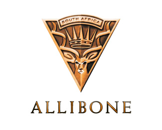
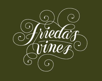
Logo for a South African wine brand. A hidden delight.
Status:
Client work
Viewed:
22142
Share:


Lets Discuss
WOW. Give me vibes from The Fountain movie. Great piece.
ReplyHey Milou. Thanks dude! I can't keep up. %3B-) I've just got 7 of my first 27 logos uploaded, and already replying to comments! Got to love it! And just found out that I need to include the typography if it's to considered for a gallery spot.
ReplyThat's for the best welcome aboard Simon! Yes that's their rules, to have full set in the gallery.
ReplyGreat. Now I've got to hire this movie, The Fountain. :-)
Replycongrats simon... champion stuff
ReplyThanks! Quite cool watching which logos people respond to. Sherbet, I've totally forgotten to get any work done today! All your fault! %3B-)
Replyvery nice, indeed!
ReplyThanks Hertzpectiv.
ReplyThis is gallery material, maybe without the drop shadow.
ReplyThanks Jerron. Yeah, the drop shadow was totally unnecessary. I just wasn't able to find a background colour that went with the logo. Actually each wine cultivar has a different colour behind the foiled gold logo. Can you believe that I've got a printed sample of the label, but have never actually seen the darn thing on bottle?
ReplyGreat stuff! I would absolutely love to see the foil printed version. You could probably shrink it a bit for display - to give it a bit more negative space to breathe. Wonderful job!
ReplyGreat stuff, Simon!
Replylooking great, Simon. perfect for a wine label. nice work.
ReplyHi Lumavine. I have followed your good advice and shrunk it down a bit. The irony is that a friend advised me to keep the logos smallish within their frames, but I was worried at the last minute that the detail would get lost. A lot of my logos are 'illustrative' - many more to follow in the coming days...
ReplyThanks Mike! One of those late night magic moments when it all came together, but can't remember for the hell of me how I got there. %3B-)
ReplyI cant help but hear Dr Dre's voice... Inglewood... or was that %22in the hood%22?... I make up my own stuff...**Anyhow... nice work.
Reply%5E hah, was thinking the same thing. and i believe it is inglewood he says. although i'm sure he has said %22in the hood%22 as well.
Reply%22...Inglewood always up to no good...%22 (2Pac f. Dr.Dre, California Love)
ReplyYeah, it's funny how we make up our own lyrics for parts we can't hear properly, and then are pissed at the singer when we find out it's not the way we imagined it. Like it's their fault. :-)
ReplyI think you'd get your ass kicked if this was a logo for any type of rapper! %3B-)
Reply%5ELol... checked it out... Next Episode and its Inglewood... everybody on the left only...**La - da - da - da - daah...
Reply... and I think you'll find its %22pop a cap in the ass%22.. not %22kick%22 %3B)
ReplyDa - da - da - da - da, it's mo'f'n D R E! :D
ReplyI really appreciate all the floats. Thanks Logoponders! :-)
ReplyThis is looking great! Personally, I'm not a fan of the dropshadow. Cheers and Welcome here!
ReplyHey lecart. Drop shadow is no more! Just a lighter red against the background. Maybe just me eyes - but it's funny how I can still see a slight dark halo around the circle's edge? Optical illusion?
ReplyHaha, I'm pretty sure there's a drop shadow, or hallow, however you want to call it. :D
Replyvery nice
ReplyYou could also lose the lighter red circle Simon? just a thought.
ReplyThanks Roy! :-)
ReplyGreat work namesake!!!
ReplySimon's rule!
Replyvery inspirational:) great work!:)
Reply%22Simon's rule!%22 haha, that's for sure! :D
ReplyNow it looks even better! :)
ReplyGreat job indeed Simon! It has a feel of something that cames from 19th century, like vintage book illustration.
ReplyThanks hyperborea. Exactly that and more specifically from woodcut bookplates (ex libris). The owner's hallmark.
Replytr u go..looks grt widout the shadow and circle...:)
ReplyIt's great to see such a nice work .. Perfect
ReplyGreat work
ReplyVery great! Some issue with the typo though, it looks a bit seperated... hm, maybe its just the size.
ReplyWatermarker - it may look a little off, because the mark and type were never intended to sit next to each other. The actual wine label has them miles apart, at different sizes, and on different colour backgrounds, but I had to configure it differently to work for presentation purposes on LogoPond.
ReplyLaziness %3B-)
ReplyI've made them the exact same red now, for those of you with eagle eyes! :-)
ReplyDavid, awesome site by the way! Works like a dream.
ReplyNice work! Your showcase is full of stuff that makes me want to work harder.
ReplyThanks devey! 'Work harder'? Just had a look at your showcase. Wow! Looks like you need to slow down! Too good! :-)
ReplyThanks for the kind words.
Replyyou have a very unique style ... very original ID pieces ... love it !
Replysick. I think I've seen this before. Very pretty.
ReplySo elegant! Lovely work!
ReplyWhat a lovely mark! I need to get my hands (and liver) on some of that wine!
Replywow....solid and elegant.....even though I don't really like the typeface.....excellent!
ReplyThis is amazing. And an awesome showcase to boot.
ReplyThanks Chanp!
ReplyFantastic work!
ReplyPlease login/signup to make a comment, registration is easy