BT
by Wizemark • Uploaded: Mar. 08 '11

Float
(Floaters:
16 )
Description:
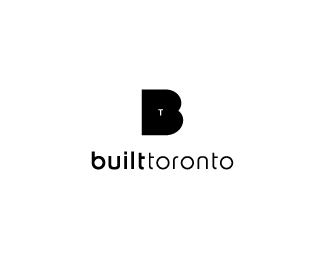
Probably best logo i`ve designed so far.. BT makes furniture..aesthetic construction.. u know, chairs, closets, lockers, Tables.. Client loves the concept, but is also in love with another proposal, so i`m hoping we`ll get on the same page regarding this one..Did i mention that BT makes Tables as well? Do you guys think that extended leg on R, or any other additional tweak/joint for that matter, would overkill it?
As seen on:
www.wizemark.com
Status:
Work in progress
Viewed:
4530
Share:

Lets Discuss
well done.
ReplyThank you, Colin. (floaters as well %3B) )..
ReplyCan be a little clamped UIL?
Replylooks good is this custom typography? I don't think you should add anything else it would %22overkill%22 it imo %3B)
Replysbdesign, u lost me. Do you mean to tighten up the kerning? Seems alright to me.. ?*Alex, thanks, mate. It%60s not custom, it%60s a typeface called Sansation (i think). If you take a look at the letters, you%60ll see that most of them are quite common looking in most cases (u, i, l, t, n). Two letters that are somewhat different are actually only B %26 R, and those two are already nicely done here, so i thought that there%60s no point forcing things while it%60s already perfect and i really wanted TT table concept to stand out. If this got selected, i%60ll might tweak it a bit, dunno.
ReplyIt seems to me it is necessary to increase a little kerning
ReplyImpressive work, man. Type is indeed Sansation, and I kinda dislike those rough cuts on the B %26 R the typeface has. But otherwise, I really enjoy this. Strong and memorable.
Replyneat!
Replysbdesign, thanks, man, i%60ll look into it.*Stelian, appreciate your comment, mate. I tend to really like those two cuts tho, cuz, imo, it breaks down the overall look and straight lines, and besides that, it also creates some openness, space and aesthetic feel, which goes nicely along with their work, approach and overall philosophy. However, this isn%60t set in stone yet, so most likely, i will play around with it some more. Thanks again.
Reply%5E%5Ethanks, Hertz.
ReplyBring from Toronto, and a big fan of your work, I am at a complete loss as to why you are saying this is the best logo you have ever designed.**What did I miss?
Reply* Being from Toronto, and a big fan of your work, I am at a complete loss as to why you are saying this is the best logo you have ever designed.**What did I miss?
ReplyThanks, man. Well, i%60m probably still under impression, but i never had a chance to design something this simple for a real client/use. I%60m sorry if this sounds cocky, but i%60m in love with this simplicity and i think that concept is brilliant, feels established and in a way timeless. I might be just tripping, you know..but usually, when concept sucks, i get that after i sleep on it.. Makes sense? :)
Replywize logotype man. if the client is wize too he will pick this solution. I will hold fingers crossed for that. good luck!
ReplyLookin' good Srdjan. The 'TT' connection is weird looking to me, but then again it's a troublesome pair. Probably the best solution is what you have here. Cheers man!
ReplyThanks, Andrej and Joe. Appreciate your comments, guys..
ReplyAny news from the client?
Replyexactly fits my favourite motto %22simple%3Dbetter%22
ReplyAndrej, they went with other proposal. Thanks, oski.
Replypih!
Reply%5Ebash.. :)
ReplyPlease login/signup to make a comment, registration is easy