Sorry dale, but a spade is a spade. The mark has the same general shape and proportions, it's in the blue family, has the same amount of calligraphic spirals and has the type locked up underneath it. But I guess since the connecting center bar is curved up instead of down in jnotario's version it can't really be considered plagiarism, so forget everything I've said...


Lets Discuss
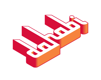
Neat design, I like how you combined the wings to create the H and a subtle B.
ReplyBeautiful.
Replytres bon love it
Replyreally love it
ReplyI love it! Excellent mark! You create an icon.
ReplyWow! Nice.
ReplyJust a question... Could you please tell me which font it is? Custom or commercial? Many thanks.
ReplyThomas, the font is Edwardian.*
ReplyHey Jnotario, I absolutely love this mark - though I wonder if it is a little too close to Brian Sooy's logo for The Angel Network.**http://www.logolounge.com/wd/uploads/326_angelNetwork.jpg
ReplyYeah, I thought the same exact thing when I stumbled across that one on Logolounge 2000.
ReplyOuch. Another one bites the dust.
ReplyTypeface really fits the wings, good job!
ReplyHmmm, verrrry close to the logo Dale mentioned...
ReplyI love this. Unfortunately, I agree with the others though. This is way too similar to the logo Dale referenced on logolounge.
ReplyWith all the respect, the concept is much too close to the up-mentioned logo...
ReplyI would say that this is way more than %22close%22. I'm sorry, but this is blatent plagiarism in my opinion.
ReplyYeah sdijock, it certainly appears that way.. though I like to be sure before I stride right in with the p word %3B)
ReplySorry dale, but a spade is a spade. The mark has the same general shape and proportions, it's in the blue family, has the same amount of calligraphic spirals and has the type locked up underneath it. But I guess since the connecting center bar is curved up instead of down in jnotario's version it can't really be considered plagiarism, so forget everything I've said...
ReplyPlease login/signup to make a comment, registration is easy