Juice Time Juice Bar V5
by richardbaird • Uploaded: Feb. 17 '11 - Gallerized: Feb. '11
Description:
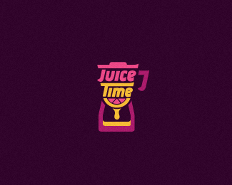
Continued development. Logo mark made up of a fruit blender and hour glass. Update: Added a bit of fruit.
The other concept can be seen here: http://logopond.com/gallery/detail/129055
As seen on:
www.richardbaird.co.uk
Status:
Work in progress
Viewed:
14439
Share:





Lets Discuss
Any thoughts or feedback on this would be appreciated.
ReplyLooks great! But my first feel was a coffee can instead of a blender.
ReplyI can see the subtle shape of a hour glass, however to me the juice %22drop%22 isn't capturing time as strong as the blender/hour glass shape. I do enjoy the refreshing color palette.
ReplyIt looks great! But I saw an espresso machine first and the hour glass is not completely clear to me (I wouldn't notice it if I didn't know).
ReplyYou've lost the hourglass from the last version.
ReplyWow - bright, interesting %26 clever logo!
ReplyThanks pik yoke and for all the floats and other kind comments.
Replyt a s t y
ReplyPlease login/signup to make a comment, registration is easy