Bebocean
by wizmaya • Uploaded: Feb. 11 '11 - Gallerized: Feb. '11
Description:
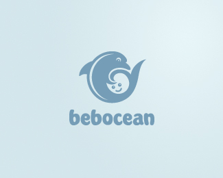
Another version of Hai Baby Shop logo ("Hai" = "ocean" in Mandarin), but the client was already too happy with the original one and closed the deal so I decided to keep this as our own experimental project. :)
Status:
Unused proposal
Viewed:
27957
Share:
Lets Discuss
this is awesom! very nice!
ReplyWonderful!
ReplyThanks Deiv and Vergad!
Replyreally nice!
ReplyThank you, Tomme. Much appreciated!
ReplyNice use of white space.
Replyoh, lovely!
Replythis is really good wizmaya!
ReplySo sweet and inocent!*
ReplyEveryone Loves Babies and Dolphins, great logo.
Replyreally great idea. congrats!
ReplyLove this idea!
ReplyFavourite! %3B)
ReplyThank you guys, really appreciate all the floats and comments.
ReplyAbsolutely great!
ReplyVery nice, indeed!
ReplyYep...this is really good!
ReplyThanks Smashing, Sean and Megashred13. :D
ReplyEnjoying your use of negative space. @ Logomotive : I like baby dolphins.
ReplyIs it only me who find this mark a lil disturbing? baby getting strangled by the dolphin.
ReplyI can see your point but it's a Dolphin not a shark. Never heard of a mean dolphin :)
Reply*Lol!* Didn't see that one coming! In all honesty, I hope most viewers will see it more as a 'hug'. O well, at least the dolphin and baby is visible. Interesting feedback tho, thx.***
ReplyI love you, Bebo!
Replyi like this one better!
ReplyFeel fresh
ReplyClever!
ReplyThanks guys! :)
Replygreat forms
Replygreat job wizmaya!
Replythat's why the babies are so lovely just like your Bebocean
Replyoverall good look but i love the type.
Replycute one ... like it so much !
ReplyPlease login/signup to make a comment, registration is easy