crowdcast
by nido • Uploaded: Feb. 08 '11 - Gallerized: Feb. '11

Float
(Floaters:
62 )
Description:
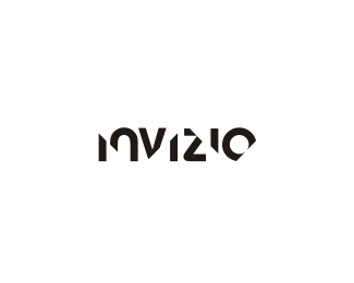
Crowdcast's technology platform is a high-performance, scalable foundation that provides powerful and flexible ways to aggregate the insights of employees and partners about key metrics and events.
As seen on:
crowdcast
Status:
Client work
Viewed:
15153
Share:

Lets Discuss
The concept for this along with additional branding elements can be viewed on my new website...**http://www.thisisnido.com/index.html?g%3DCrowdcast
ReplyThat type is great!
Replygreat work!
ReplyFantastic on your new site Nav.
ReplyLooks awesome
Replynice work, nido. saw the spot that goes with the new logo on your site, sweet. great work all around.
ReplyNice and neat
ReplyThanks guys... the new sites been fun working on.
ReplyInteresting site how it scrolls horizontally instead of vertically.
Replylove your customs types)
ReplyReally digging the type! Fantastic job! :)
ReplyExcellent job, friend.
ReplyNice! Looks pretty much finished, but I really want to see the dc ligature connected.
ReplyThis looks amazing and your website too :)
Replygreat work, both here and on your new website
Replynice typo nido.. can we see some more color variation in the same style?
Replyreally awesome:)
ReplyThanks again everybody... **@hamidos... import into photoshop and knock yourself out %3B)
Replyawesome typography
ReplyNot these again. Great work Nido
ReplyThanks outlander...**@Gareth.. lol.. still having nightmares %3B)
ReplyNice site update. I also like this typo mark.
Replylove the site nido, some amezzin logos on there
Reply@pjmaster %26 hermes.. thanks a lot fellas...
Replygreat stuff! love your new website, clean and to the point. :)
ReplyNice typework nido. d seems like the right place for the accent, nicely divides two words of the brandname.*And yes, congrats for the new website man.
Reply%5Ethanks to you two too...**2.
ReplyWhat's the base font you used? Or is it completely custom?
Reply%5Eooohh :D... I wonder if anyone can guess.. I thought it'd be easy :)
ReplyVery cool all around, nice stuff.
Replyvery nice particularly that little touch on the 'd'. your website looks great, I really love that colibry identity piece, savage piece of work.
ReplyDunno...I'm stumped on the font.
Replynice typo!
Replythanks all.. :)
ReplyCongrats, very cool type-work.
Replythanks milou...
Reply%5E :D
ReplyNice type, man!
ReplyPlease login/signup to make a comment, registration is easy