by kairevicius • Uploaded: Feb. 04 '11 - Gallerized: May. '11
Add to Pad (In 22 Pad s )
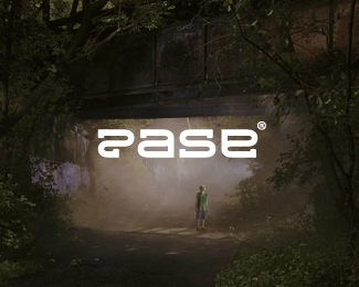
Description: Final Paul ambigram. Status: Client work Viewed: 10952 Share:
nice !
Cool stuff!
smart...i like this...
Thanks guys :)
YESSS
very nice :)
nice job. floated earlier, but just had to say nice gallery addition.
Cool logo, but you're paying for the neck strain from flipping my head to see this! %3B-)
yay!
Thanks you all! It was very unexpected to see my logos in gallery.*The dream come true!!! THANKS! :)
Sveikinu! Trys logai.... Labai grazu
labai netiketai :) Aciu!
Ambigramstrocity!
I love such lettering %26 ambigrammes
WOW MOM
@Alena, this is my favourite letter style I think :)*@Raja, haha :) By the way, you have very nice sunglasses :D I love wayfarer!
I like it, thought the lettering looks a little like Raul as well.
Nice ambigram, Paul! Reads very well.
%5Emission completed!
did you get enough answers??? I'm still thinking ... but I like it ...
answers about what Bernd? And you thank you for your compliment :)
damn I made a mistake!! Logopond I am always wondering why there is no edit button?
metaphysical questions ... %3BD
what kind of mistake ???
I wrote you two times :D (you thank you)*Edit button would be very useful I think :)
don't worry about that ... !
WoW
Clever and well executed.*Nice flow.
Please login/signup to make a comment, registration is easy
Follow


Lets Discuss
nice !
ReplyCool stuff!
Replysmart...i like this...
ReplyThanks guys :)
ReplyYESSS
Replyvery nice :)
Replynice job. floated earlier, but just had to say nice gallery addition.
ReplyCool logo, but you're paying for the neck strain from flipping my head to see this! %3B-)
Replyyay!
ReplyThanks you all! It was very unexpected to see my logos in gallery.*The dream come true!!! THANKS! :)
ReplySveikinu! Trys logai.... Labai grazu
Replylabai netiketai :) Aciu!
ReplyAmbigramstrocity!
ReplyI love such lettering %26 ambigrammes
ReplyWOW MOM
Reply@Alena, this is my favourite letter style I think :)*@Raja, haha :) By the way, you have very nice sunglasses :D I love wayfarer!
ReplyI like it, thought the lettering looks a little like Raul as well.
ReplyNice ambigram, Paul! Reads very well.
Reply%5Emission completed!
Replydid you get enough answers??? I'm still thinking ... but I like it ...
Replyanswers about what Bernd? And you thank you for your compliment :)
Replydamn I made a mistake!! Logopond I am always wondering why there is no edit button?
Replymetaphysical questions ... %3BD
Replywhat kind of mistake ???
ReplyI wrote you two times :D (you thank you)*Edit button would be very useful I think :)
Replydon't worry about that ... !
ReplyWoW
ReplyClever and well executed.*Nice flow.
ReplyPlease login/signup to make a comment, registration is easy