Avion Hotel
by gutdesign • Uploaded: Feb. 03 '11 - Gallerized: May. '11

Float
(Floaters:
30 )
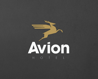
Description:
Logo for a hotel in Poland
As seen on:
Avion Hotel
Status:
Work in progress
Viewed:
7793
Share:


Lets Discuss
Like the fonts a lot!
ReplyWhat a lovely mark!
ReplyFonts! 1
Replythe A is a little too close to the v. I would add a downward bend to the wings to help the stag look even more like it is flying. right now the wings kinda just look like a cape going straight back, whereas, the stag looks like it is going up at an angle. these are minor critiques, however. I really like this.
ReplyPlease login/signup to make a comment, registration is easy