WIP
by JF • Uploaded: Jan. 29 '11 - Gallerized: Oct. '11

Float
(Floaters:
32 )
Description:
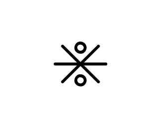
Think 'magnificent' or 'magnanimous'...splendid royal qualities. The root, 'magni' means 'great and powerful'. A simplified crown is in there.
Status:
Work in progress
Viewed:
5702
Share:


Lets Discuss
Simple and nice, JF %3B)
ReplyThank you, very much!
ReplyThanks for the floats, morecolor, vernics, and contrast8!
ReplyClean %26 nice!
ReplyThanks for saying that, epicantus! That's very nice.
ReplyThanks for the float also, epicantus. That was nice of you to do as well!
ReplyThanks! Will try that.
Replysimple%3Dbetter %3B)
Replysimple and cool!
Replycool simplicity JF!
ReplyWhat a bright concept. Well done.
ReplyWow, thanks oski, aneeshsyamala, hitbyreindeer, and nickhood. Appreciated.
Replyfor me, %22M%22 is to small for the rest of typography, but totality is ok
ReplyThis is very clean, readable, yet catches attention so nicely. Have you tried it with coloring the crown? Nice work JF!
ReplyVery nice %26 solid
ReplyThanks for the kind words and floats, everyone. This one will likely be modified, as it's now just for my own enjoyment to work with, rather than a project. More of a concept-at-work than anything else.
ReplyNice idea. The NI needs some extra kerning, and probably also the GN.
Reply6agre with a litte love on the kerning, but solid design.
ReplyThis is a project that stalled%3B kerning will be amended when I get back to it. Thanks for your feedback, folks. **And, wow -- thanks for the gallery spot, LP Gallery team. Whoever chose it, I am very flattered. Thank you!
ReplySimple but solid.. Be carefull the M could seem like a letter and not a crown.. Otherwise great logo design.
ReplyGreat potential behind this one.
Replyi have to admit, i initially thought it was a mail delivery company. however, the description helped to clarify things. nice concept though!
ReplyPlease login/signup to make a comment, registration is easy