Destino Turistico Santa Cruz Bolivia
by josepetit • Uploaded: Jun. 27 '07 - Gallerized: Jun. '07
Description:
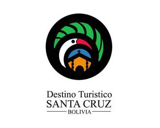
Designed to promote the tourist destinies that it offers the city of Santa Cruz in Bolivia. It contains elements of the natural and patrimonial diversity of the territory.
As seen on:
www.petitpetitestudio.com
Status:
Nothing set
Viewed:
12731
Share:



Lets Discuss
Nothing to change! With such a lengthy name but still manage to balance this out together with a spectacular mark, bravo! Thumbs up in every department for me.
ReplyI love this logo. I do feel that the circles are a bit too thick. I thing making them thiner will more beautifuly integrate the three elements inside.
ReplyThat's amazing, I've been to santa cruz once, seeing this logo makes me wanna go back!**Good job
ReplyAn excellent logo. Its significant and gorgeous. And it works in b/w. I agree with mokenke, perhaps make the lines a little bit finer. Great job!
ReplyTry make the strokes (mostly by the green area and the beak) all the same size. Id also mirror the windows on the right side. Near the bottom of the birds neck it has a rather dirty curve.**I think this is a great concept and hope you can render it even better.
ReplyI like the logo pretty much, the elements are good arranged and i guess they characterise Santa Cruz really good. But i agree with mokenke that the circles are too heavy. The elements getting smothered by the black shapes, they have not enough space for beeing the essential thing in the mark.*Getting the whole thing a bit lighter would support the nice elements inside and of course the impression of santa cruz as a tourist location where you can relax yourself. **The type is PERFECT.*
Replyamazing !
ReplyI like how the uneveness of the stokes in the mark adds character. Don't change a thing.
ReplyA true beauty!!
ReplyReally nice, but the black strokes are overpowering the main graphical elements a little.
ReplyThanks to all for the opinions, ithelps me to continue forward. Soon estre showing them more. They can see the applications of the logo in www.destinosantacruz.com %0D*Best Regards
ReplyA unique concept, well done. I'm curious how this would look if you deleted the black background altogether and tightened it up a little.*The bird could borrow one of the neighbouring colours. Nice work.
Reply*Boy, you're really a fan of using birds in your logos.
ReplyHi kurt, thank you for your appraisal. Actually these works were realized for different companies that they needed to introduce the concept of the bird in the logo. You are cordial invited to looking at our other logo and to leave us your commentaries. Cordial regards
Replybeautifull!... im jealous!
ReplyThanks Nido :) %0D*%0D*Cordial Regards
ReplyBeautiful logo image!
ReplyHi Relevant%0D*%0D*It is an honor to be able to read so good things. Thank you for your good energy.%0D*Cordial regards
Replyexcelente logo, buen trabajo!!!
ReplyGracias efe-zero, comentame de donde sos.%0D*%0D*Saludos
ReplyGreat job, I agree with the people before me. I just don't feel that Times New Roman in place... use other serif, Legacy Serif for example - anything but Times :)
ReplyHi Neogrey%0D*%0D*Thank you for your commentary and to contribute your suggestion. %0D*%0D*Cordial regards
ReplyI really like this one, but feel the outside outline BLACK needs to be reduced to the same size as ithe inner circles/parts.%0D*
ReplyHi Logomotive%0D*Thank you for your suggestion. Actually the black contour I realize to support a rectangle between the figure and the letter. I expect it has liked to you%0D*Regards from Bolivia
Replynice!!
ReplyThaNKS bogglins !!!
ReplyGracias Lalohead%0D*%0D*Gracias a dios un comentario en espa%F1ol jajajaj.%0D*%0D*Un abrazo desde aqui
Replybeautifull , this logo catch my eyes
ReplyThank you for your words Magicshadow. I invite you to see my other works, cordial regards
ReplyPlease login/signup to make a comment, registration is easy