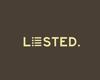
Listed
by epicantus • Uploaded: Jan. 21 '11
Description:
Logo was made just for fun :)
Status:
Just for fun
Viewed:
4884
Share:



Lets Discuss
Lested.
ReplyMaybe shorten the i? reads as LESTED to me.
ReplyI thought to make from few turned letters %22i%22 a list. That's why there are not 3 but 4 turned letters, then it's less associated with letter %22E%22.
ReplySmart logo!
ReplyI have to agree with Mike. It reads as Lested right now but, if it were thinner, it might look more like an I.
ReplyI have the same problem, reading it as liested / lested.
ReplyThis is a classic. Great.
Replynice, if you played the same game in letter %22E%22 that will be great! then logo motive nothing to say...
ReplyI like it...you all are way better than me hee hee...this is my first year
ReplySimple and clever. Like it.
Replyvery nice Daria
ReplyCool! I think it is worth trying with the E instead.
ReplyThank you for your comments, guys! :)
Replyi always like this kind of style..nicely done!
Replysmart concept but i keep reading lested. I agree with logomotive, maybe shorten it a bit?
ReplyClean&clever work =)
Replyso nice
ReplyI really like this. I'd bring in the period a tad, he seems so lonely!
ReplyCool!
ReplyI read listed immediately because the icon itself means list view. I like.
ReplyPlease login/signup to make a comment, registration is easy