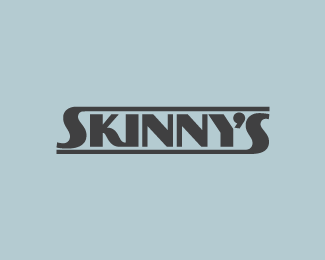
skinny's
by florisvoorveld • Uploaded: Jan. 19 '11 - Gallerized: Jan. '11
Description:
for a music bar
As seen on:
florisdesign
Status:
Work in progress
Viewed:
5140
Share:


Lets Discuss
Clever incorporation of the Y and the apostrophe, I read it immediately without problems.
Replygreat!!!
ReplyThanks all :)
ReplyNice play with the ' and y, oh I just notice somebody wrote that above.
Replyclever and well executed.
ReplyWell executed. I agree, the apostrophe is a great touch. However I'm wondering how the lettering style relates to the name as it seems a little contradictory here.
ReplyWow-wow-wow
ReplyI like the contradictory style... I know a bloke 6,6%22... we call him %22shorty%22... nice work no name...
ReplyBad ass!
ReplyThank you all very much :)**The paradox/contradiction is collateral by the way
ReplyMooi Floris!*Erg goed gedaan!
ReplyDank je Cuno :)
Replyexcellent logo reads the same if you flip it over, very good...
ReplyGreat, i like it :)
Replywhat font is it please :)
ReplyThank you all**@dean: it's an adjusted version of PAG Bankas
ReplyPlease login/signup to make a comment, registration is easy