New Jersey Ironmen
by robertscully • Uploaded: Jun. 20 '07
Description:
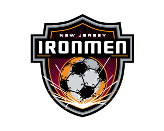
Just finished developing the New Jersey Indoor Soccer League's logo and branding program, for the New Jersey Ironmen. The new team will play their first game this fall at the new Newark Prudential Arena.
As seen on:
robertscully.blogspot.com/
Status:
Client work
Viewed:
13742
Tags:
•
ball
•
shield
•
brand
Share:


Lets Discuss
Dude, NICE logo! As a designer from NJ and former soccer player, well done. I only have two minor suggestions. 1.) Take out the black gap between the %22R%22 and the %22O%22 as it's a little distracting and you don't need it. 2.) As cool as the red sunburst bars are in the background they might fill in at smaller sizes - maybe take some out and make them slightly thicker.
ReplyThe black gap between the R/O doesn't distract me whatsoever, and I disagree with the burst lines. Not every single detail must be completely distinguishable at minute sizes. I think the fine lining gives it a crisp sense of detail and refinement.**My only two suggestions are to work on the outermost gray border and give it a simple highlight bevel as it's a little %22rubbery%22 looking (unless that was your goal? Sorry..bad pun) and I think the steel of the soccer ball could use a light, streaking highlight band across the plates to really hammer in that %22metal effect%22. As it is, the ball looks a little too much like it's in the shade. Since it's indoors, the illusion of a ceiling light striking the steel plates would be a nice touch.
ReplyHmmmmm nice indeed :))) I like that along with the metal ball you added the welding sparks (I think?) like the metal ball bounced off a metal player's foot or something, nice touch :))
ReplyWell kult house, since we're in a disagreeing mood, let me disagree with you. I think the soccer ball is fine as it is. He's trying to convey a soccer ball in an iron mill. Iron mills are dark places, so showing light bouncing off the top of the ball wouldn't make sense. Also, the shading on the ball is lighter at the base where the sparks illuminate it and darker at the top. So adding lighting to the top of the ball would defeat the purpose of the spark light. As for the sunburst lines, I'm not suggesting taking a lot of them out and I'm not suggesting making them really wide. If the intent was to keep the lines legible then my suggestion to robert would be to modify them slightly so it would work at all sizes. When I design logos I strive to design for legibility and to maintain the integrity of the logo in whatever capacity it's used in - which my clients tend to appreciate, as I'm sure robert's would as well. And taking the gap out from between the letters would make the logo cleaner. I'll give you the border comment though.
Replytnx for the comments guys.*I appreciate them.**Cheers*-Rob
Replysdijock, I understand the sparks are illuminating the ball. I wasn't trying to suggest he change the entire lighting of the ball, but to make the front plates get an extra kick of reflective light on them so they aren't quite so plastic looking.
ReplyGreat concept and execution Rob.
Replywell executed
ReplyCOOL!
ReplyTotally underrated. Great work, Rob.
ReplyPlease login/signup to make a comment, registration is easy