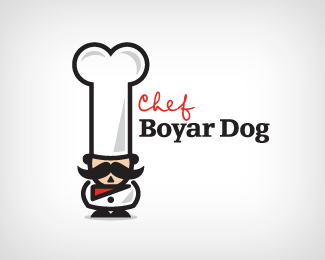
Chef Boyar Dog
by DoubleA • Uploaded: Dec. 17 '10 - Gallerized: Dec. '10
Description:
Dog food and supply shop
As seen on:
doubleacreative
Status:
Nothing set
Viewed:
24653
Share:




Lets Discuss
though it's a nicely illustrated mark, it seems too phallic..**You don't want it ending up on something like this http://www.jonhs.net/naughtylogos/
ReplyYou guys are a little perverted %3B) I see clearly a bone...
ReplyI don't think it's phallic, I just see a bone and not a bone* too %3B)
Reply%ABSometimes a cucumber — it’s just a cucumber.%BB %A9 S. Freud*I mean that I see clearly a bone, too (-:
Reply↑ in previous comment*Sometimes a cucumber it's just a cucumber.
Replycrazy name, why the name is boyar dog. your customer is dog%uFF1F
ReplyI Agree with Danny, it definely has the wrong subliminal message...
ReplyHAH funny idea! I got the reference to chef boyardee www.chefboyardee.com%0D*Clever!
ReplyThe phallic symbol is very apparent. It's not the kind of subliminal message any company wants to send.
ReplyThanks for the comments everyone. I didn't see anything phallic about it when I was designing it. But I thank you for being honest.
ReplyNot that it has anything to do with you, Double A, but I wonder if there are any legal implications with using that name?**Also, hidden phalli aren't necessarily a bad thing - advertisers have been hiding wangs in things for decades - sex sells %3B)
ReplyBTW: Past the implied imagery, I wanted to mention I do like the logo. It's clean and has a lot of character. Keep up the good work!
Replyfunny idea!
ReplyHaha..cool stuff.
ReplyWonderful style.
ReplyThx guys. The comments are appreciated.
Replygreat idea I like it.
Replygreeat stuff
ReplyNice one. I totally get why others are seeing this a phallic, but honestly, it's clearly evident that it's a chef hat and a dog bone, and that absolutely no reference to a phallic imagery is implied. So if you're seeing a dong, well, go take a cold shower %3B)
ReplyWhile I think this logo is an exception because of the bone/hat shape's interactivity, it's true that we as designers are trained to see any hint of phallic symbols. Not because we're perverts but because if we can see it, then somebody else will. And once you see it, you will always relate it, unfortunately. You need to eliminate any ulterior interpretations from your work to help it's success. Not doing this is just plain lazy. But to restate my first point...this mark is really clever and I think should be ok. You have a great body of work.
ReplyThanks you for the comments and options. I appreciate the insight.
ReplyThis need to see turned over...
ReplyPlease login/signup to make a comment, registration is easy