Health & Beauty
by paveltamakulov • Uploaded: Dec. 16 '10 - Gallerized: Dec. '10
Description:
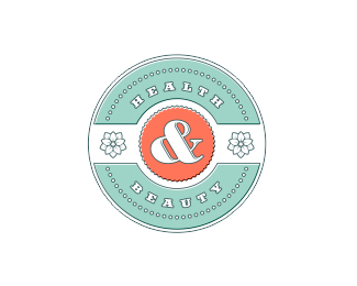
Mark for Health and Beauty Center
Status:
Client work
Viewed:
19026
Share:


Lets Discuss
Nice! Are you slowly rolling out your body of work or is all this stuff you have been working on lately?
Replyyou have some nice %22seal%22 style designs going on there..
Replyanother great seal.
ReplyThanks for all!
ReplyReally liking your work man.
Replyclass!
Replysweet ampersand. love the style.
ReplyReally nice feel in this crest! :)
ReplyWhy am I such a sucker for enclosure logos? :-) Since you're actively seeking feedback, I have a couple minor suggestions. The text could be a little larger (not the ampersand). By doing so, you'll probably want to move the dots out a little closer to the edge. And I think the colors could be a little more soothing. The orange is a little intense and energetic. Nice work all around.
ReplyYou have a very clean, distinctive approach that is so easy to admire. Keep it up!
ReplyReally thanks for all!
ReplyEspecially like the colour choice. Great one.
ReplyAgree with above. Wanted to say the same thing.
ReplyI agree with Ocularink (and I'm glad he said it amidst all the praise)--the %22HEALTH%22 and %22BEAUTY%22 need to be larger, with the adjustments mentioned to compensate. But that is really the only issue I see with it. Other than that, the design is beautiful and so is the color palette.
ReplyThanks for all the comment and critics, guys!
ReplyPlease login/signup to make a comment, registration is easy